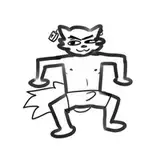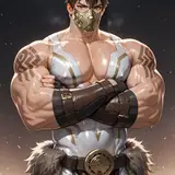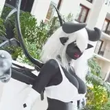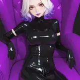
Just doing some tags testing for my next request, and I came upon a problem of sorts. Due to the requested character having not many pics on danbooru, the colors kinda look... off. In any case, I did some testing with the flat color for this kind of character (aka not having many pics on danbooru, or the pics are old) for better consistency.
The 1st one is flat color. The 2nd one is normal color. Personally speaking, I kinda like the 1st one: it makes the color and the lines and the scene look sharper, y'know :3
In any case, do tell me your thoughts! I'd love to hear it :D
Grant B
2025-09-17 10:23:52 +0000 UTCAccelerat3
2025-09-16 19:10:32 +0000 UTC