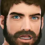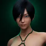
For this render, I used complementary colors. I wanted to try using a more complicated lighting setup for this one. The blue was a normal, solid light, while the orange light used a gobos for add a bit of texture to the lighting. On top of this, I also added secondary fill lights for both colors so that the tone of the shadows would match the light on each side.
I think this came out fairly decent, but I'm not completely happy with it. I feel like I need to get better at conveying depth with these types of portrait renders, though I'm not too sure how I should go about that.