here's the process video for october's motm painting of an eldritch angel & their lover! you can download the attached video below.
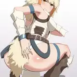
this design is relatively complex, with many different parts overlapping each other and lots of elements and details to take into account. despite this i found it strangely easy to figure out the basic pose, and i guess that positioning each wing and limb was time-consuming but not too difficult, if that makes sense? i went through four and a half sketch layers before moving on to the lineart, each new stage looking more refined and precise. even after finishing the lineart i kept the two final sketch layers somewhat visible beneath it, because it makes the lineart look more 'sculpted' even before i've started colouring. the lineart itself is pretty thin and the many details mostly serve as guidelines when rendering the characters, because after i changed the hue of the lines to a bronzey brown it's not long before they start to blend into the colouring.
i used a mixture of colouring methods for different parts of this piece, so rather than outlining the process in a 'chronological' order i thought i could talk about how i approached the different areas.
the wings are fairly stylised, both in shape and colouring style. rather than referencing any real bird they are inspired by the unnatural way angel wings are sometimes drawn, with the 'hooked' wrist. i used a charcoal brush to add a textured gradient to each wing, starting with gold that fades into royal blue that fades into a darker blue. none of the feathers are rendered or shaded; instead i added stylised gold outlines to the primaries and secondaries, and little notches of pale yellow along the upper edge to indicate the coverts. i experimented with various overlays of gold and blue to determine how bright or vibrant the cluster of wings should be; the bronze-coloured body should stand out against it, but without making the colour palette look less cohesive. i opted for a cold blue gradient behind their body, which 'boosts' the fiery hue of the bronze.
speaking of their body, it's rendered in a pretty painterly way. i used a charcoal brush to add some initial gradients, but quickly switched to the 'gloaming' brush. i added shadows and highlights to the medium hue of the base colour, 'sculpting' the shapes of their body and the decorative elements that jut out from their limbs. since the surface is inspired by copper and amber i wanted it to be shiny and vibrant, although it needn't look completely metallic. i again trial and error'd my way to a few cool layer effects; adding some shadows and a warm overlay made their body look less monotone, despite technically being the same colour all over. the human's body is rendered in a similar way, but his smooth skin creates a nice contrast to the intricate shapes of the angel.
you'll notice that i re-drew the shapes of the ornate 'holes' in the angel's body, because i wasn't happy with the first iteration -- the details were too small, too 'rounded,' and looked messy rather than elegant and artful. i erased the lines that delineated the holes and started over, with much better results.
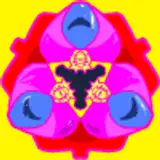
the colouring of the ophanim object head is fairly simple, because i didn't want to confuse the shapes of the rims and spokes with details and textures. note how the slight tilt of the cluster of wheels makes it look like they're fondly looking down at their lover. i'm pretty proud of how that detail adds some sense of expression and emotion to someone who doesn't have a face.
the eyes on the wings are intentionally super stylised and lack three-dimensionality, because i wanted them to look weird and artsy. they blatantly defy the shapes of the wings, because regardless of their placement the eyes are all viewed from straight ahead, even when the wing itself curls. note how the eyes near the wrist are opaque while those towards the shoulder of the wing start to fade away. it makes the distribution of details across the painting look more balanced and digestible, rather than messy and overwhelming. that's also why the eyes on the angel's body are more subtle, following the shapes of it and blending in better.
as for the background, it's supposed to make the piece look a bit like a fresco -- imagine seeing it in the ceiling of a very kinky church. the yellow ribbons have a lot of three-dimensionality, thanks to the dark shadows added to where they twist and turn. but they don't actually have much detail and texture, and this is again a deliberate choice; it keeps the ribbons from stealing too much attention away from the focal parts of the painting. the same thing can be said about the low contrast look of the winged wheels and the little flames, and the use of pale blue serves to make the vibrant characters pop against the muted background elements. the bone white is inspired by frescoes that use such a hue as the base colour, and the texture of the background is supposed to mimic the surface of plaster.
the colour palette is centered on yellow, bronze, and blue. the ribbons, the wheel head, and the outlines of the feathers are gold, with the coverts of the wings being somewhere in-between that vibrant hue and the bone white of the backdrop. there's a red undertone to the winged wheels, echoing the vibrant copper hue of the angel's body, similar to how the pale blue tones of the background elements echo the bold blue colour of their wings.
towards the end of the process the original lineart was nearly invisible, so i used a fine brush to go over the lines that needed to be emphasised. at this stage i polish the whole piece, cleaning it up and adding little details. note the faint pale lines behind the human's hair, the wheel head, and the animal snouts; it helps these elements stand out against the background.
i finally added a subtle hint of plaster-like texture to the whole painting. now that i think about it i regret not adding little cracks and scuff marks that would have made it look even more like an aging fresco in need of some restoration...
if you have any questions about this process, feel free to comment below!
// art + characters © me.