here is the process video for my recent painting of cian and elena--access it by downloading the .mov file below!
if the pose looks familiar, you might remember it from the upper left corner of this sketchdump i posted a couple of months back. i sketched it long before i even knew which characters i wanted to draw, along with a ton of other nsfw pose doodles. sometimes my brain is just full of neat positions, angles, activities, and moments i'd like to depict. whenever that kind of inspiration hits me i try to sketch as many of those mental images as possible, even if it's just super simple stick figure doodles, just so i record all those ideas. sometimes i end up refining a few of them more or less at once, and with others i know for sure that i want to turn them into finished pieces eventually, even if it ends up being 'later' rather than 'sooner.' but it's also good to have this "catalogue" of nsfw scribbles to choose from whenever the wells of inspiration run dry. some days i really want to draw, but can't think of a smutty pose to save my life, and that's when i end up scrolling through my sketchbook posts, looking for a nsfw sketch that strikes my fancy in that given moment.
... i'm getting incredible deja vu right now so i have probably rambled about this before, but anyway THE POINT IS that if you make quick sketches of nsfw pose ideas as they materialise out of nowhere, you can return to them whenever you want to draw some smut but find yourself staring at a blank canvas with an equally blank mind. the same goes for any type of art, of course, not to mention colour schemes or design concepts. i feel like most artists know how frustrating it is to have a ton of awesomely creative ideas... only to realise you can't recall any of them when you finally sit down to draw a few days later. basically if a good idea comes to you, don't give yourself a chance to forget about it. make a quick doodle or jot down a note, even if it's just a keyword!
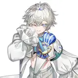
sometimes a pose sketch immediately has the vibe of a given pairing, and other times there's more character combinations to choose from. in this case i didn't immediately think of cian and elena, but once i did, my mind was made up. the basic anatomy and the size difference already made sense, i just had to add their heads and tails. but man, did it take me a while to figure out how to pose elena's upper body, and how to draw his face from that angle. the video shows all the trial and error i went through before i finally figured it out. i used the 'gloaming' brush to gradually refine the sketch and the anatomy, fine-tuning and adjusting where needed.
actually, i've made scattered mention of some of my brushes before, but this is a good opportunity to name all of them in the same place: when i felt confident about moving on to the lineart i switched to the 6B graphite pencil brush, which is what i generally use to line things in procreate. next, i use the studio pen ink brush to outline and fill in the basic flat colour of each character (on separate layers). as for rendering i primarily use the 2B compressed charcoal brush for gradients and 'bigger brush strokes,' and the aforementioned 6B graphite pencil for detailing and refining. i also use the same charcoal brush or a standard airbrush for 'special effect layers,' aka where i add gradients and play around with the layer settings to create neat effects. i may use other assorted brushes for textured backgrounds, splatters, or specks, but the 5 i just mentioned are my main ones.
i love colouring cian and elena, because they both have warm, earthy, autumny palettes that go so well together. in fact, they almost go *too* well together, and the main challenge of drawing them is making sure you can tell their bodies apart. if i'm not careful, they might just blend into a confusing mishmash of orange and red and cream. half-way through adding the basic gradients to cian's body i almost started over, but decided to keep working on my first attempt and rely on my ability to adjust the colours 'in hindsight,' once i'd laid the foundation. for the moment, i focused on getting the shifting hues of his fur right and on refining the details of the colouring. i also added a background. it started out green, and though i experimented with making it boldly similar to gold foil i ended up playing it a bit safer, with a pale hue that's somewhere between green and cream.
i kept adding details, hints of texture, and fine-tuning the colouring. my style is still relatively 'flat-looking' in that it doesn't have a lot of shading and (high)lighting going on--and i don't mean that as an insult to myself. it's a very deliberate choice on my part to use a flat colouring style, simply because i like the aesthetic of it. to create a sense of depth i rely more on differences in value, saturation, and hue; on line thickness; on more or less exaggerated or subtle 'special effects;' and on other stylised techniques that i currently really enjoy.
on that note, soon enough i started experimenting with this piece, putting it through a pretty sudden transformation. on the one hand, i made elena's skin more pale and his fur more vibrant, with a brightly golden undertone. on the other, i first tried making cian's coat more reddish, but it didn't quite do the trick. instead i actually toned down the saturation a bit and made him slightly darker by adding a "wash" of green to the cream-coloured areas of his body. i added a similar overlay of green to parts of elena as well. however after going over the linework and details again i changed my mind and erased the green from at least his face, so it looks brighter and kind of 'pops out' from under the hovering shape of cian's chest.
you can see some thick lines briefly pass by where i basically double-check the anatomy of elena's legs and hips, just to ensure that it makes sense. but whenever you do that, make sure you're doodling on a new layer with nothing else on it, so it's easy to delete lol. the greatest horror of digital art is suddenly realising you've been drawing on the wrong layer...
i made some final adjustments (like extending the dark 'sock' of elena's foot to his knee, so his calf would be easier to tell apart from cian's arm) but i eventually had to stop being a perfectionist about it and just call it a day. by then it was much easier to distinguish one character from the other, compared to earlier in the process, so i was plenty pleased with the result. to reiterate, the colouring of elena is a bit brighter, higher contrast, and has a vibrant golden undertone, while cian has a green-ish undertone (where their bodies overlap), less saturation, and somewhat more muted and dark tones. all these little contrasts between the characters make the pose easier to read despite the many overlapping body parts, but they're subtle enough that the colouring style looks cohesive. it's been a few years now since first i started using such tricks to improve my art. it's taken a lot of experimentation and trial and error to figure out what works and what doesn't, and i still have a lot to learn, but gradually getting a better hang of it is one of my greater creative accomplishments in the last few years. it's been very fun, and really rewarding to feel like i can see the difference over time!
as a closing thought, is it just me or does something about the colouring style and palette of this painting remind you of a (renaissance) fresco...? i think it’s the combination of the earthy hues, a plaster-esque off-white background, and the ‘worn’ texture of my beloved charcoal brushes...
if you have any questions about how i created this drawing, just comment below <3
// art + elena © me; cian © kubi.