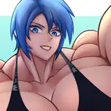
here's the process pack for my recent painting of luca and rin--download the attached .zip to get access to 15 pngs and 1 gif!
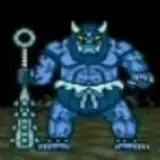
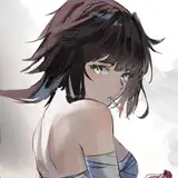
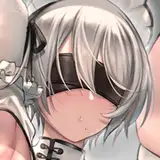
this process is a good example of how i use big brushes and sloppy brush strokes to do a rough pose doodle, before using smaller and smaller brushes to refine the sketch, bit by bit. this is when i iron out the kinks of the anatomy and posing, followed by figuring out the details of important/focal parts of the image, such as character faces, genitalia, hands, and any complex design features. i keep some parts of it relatively rough (for example i feel comfortable drawing the lines of luca's neck fluff without further refining it on the sketch) while spending more time and attention on others (in this case i wanted to make sure i had the details of their faces figured out before even attempting a lineart).
the potential drawback of spending a lot of time on refining a sketch (or parts thereof) is that things might get lost in translation when you draw the lineart. many artists (me included) have experienced liking the sketch more than the finished drawing, probably because the sketch seemed more alive and animated, less rigid and stiff. in this case i struggled with converting the rough sketch of luca and rin's faces into a lineart without losing that 'raw' vibe visible on step 02. i eventually ended up happy with the lines, but as you can see i still kept the sketch layers faintly visible under the lineart. i cleaned it up at places so that it wouldn't look too messy and sketchy, but i liked the subtle way it made the lineart look more 'vivid.'
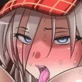
i used three layers for the basic flat colours of luca's body, rin's skin, and rin's hair. locking the transparency of these layers made it easy to start adding basic gradients and chunks of colour. i selected the relevant area with the lasso tool (for example luca's arm) and used the airbrush to add either a soft gradient (again, his arm) or colour in a chunk with sharper edges (like on his tail).

next, i started using a square, textured brush to refine the colours, create texture, and add details. i was basically 'sculpting' luca, 'carving' him from the basic flats and gradients. i deliberately kept the colouring on rin more 'flat-looking,' to create a contrast between his smooth skin and luca's fur. but even then i took care to use contrasting colours and values where rin's body parts overlapped one another, so he wouldn't just look like a mess of skin-coloured limbs. for example his elbow is darker than his chest, and his wrist is lighter than the thigh behind it, which makes it easier to read the posing of his contorted body.
luca's fur is supposed to be dark greys fading to black, but he's also got some silvery grizzling going on, which i tend to emphasize in my art of him because it's just a Good Look. i feel like sometimes it makes me colour him a bit lighter than he 'should' be, but hey, i can always blame it on the lighting... at step 09 i added some pale blue-white overlays to the more silvery parts of his body, which i think really made the colouring pop.
i kept adding details and then all of a sudden i had painted the background as well. at that point, however, i felt like the image looked a bit gloomy and dull--not in a bad way, but i wanted to see what would happen if i played around with the values and contrasts a bit. i liked the way rin's skin seemed to 'come alive' and the subtle blue undertone of luca's fur is a design detail that sets him apart from some of my other dark/black wolf monster boys. but as for the background i found i had taken it too far in the other direction--it was no longer too dull, it was too high-contrast. i promptly toned it back down a bit and ain't that the beauty of digital art? it's pretty easy to go back and forth on stuff, trying new things without having to worry about irreparably ruining a piece.
i also added a pale green gradient to certain parts of the characters, noticeably luca's tail and left thigh, as well as rin's right leg and right shoulder. if you've looked at my other process packs you already know this is one of my favourite ways to create depth and make an image/pose easier to read.
after that all i did was adding some finishing touches, and then i decided the piece was done. i liked the balanced distribution of details and texture throughout the painting, the relatively smooth and clean look, and the oddly serene colours. i had gradually been adding smaller and smaller details throughout the process, and the lineart was pretty thin and refined from the start, so there was no need for a final round of polishing the edges. i had already adjusted the brightness and contrast, and though i experimented with the colour balance a bit i decided i liked the original colours best. sometimes that's just the way it is--you're prepared to keep working on a piece for a bit, but as you try to figure out what needs to be done you realise you're already happy with it and it's like oh i guess it's finished???
// art + luca © me; rin © kubi.