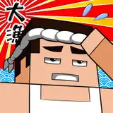
here's the process pack for my latest drawing of weshau and minoru; you can download the attached .zip below, it contains 18 pngs and 1 gif.
this was one of those images that started with a pose idea and a rough doodle--i wanted to draw someone being bent in half, viewed from behind. it was only after i'd drawn the basic sketch that i even decided which pairing it was going to be. i chose weshau and minoru because their names came up a while back when i asked for suggestions of which pairings i should draw, and also because i have a backlog of tumblr messages of people saying they'd love to see more weshau and minoru. they seem like one of our most well-liked pairings, which makes me so happy!
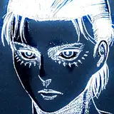
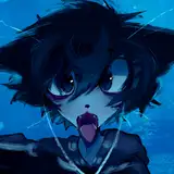
i edited the rough pose sketch to look like them--adding minoru's rabbit tail and feet, as well as weshau's tail and feet and fluff and his tentacly mane. only problem is that with this angle, the mass of furred tentacles above his shoulders might look a bit confusing unless you're familiar with weshau's design--even his ear and what little you can see of his head kind of blends into the rest. but oh well, it's not his neck and head that's the focal part of this image anyway, right?
once the lineart was done, i made it blue, changed the layer setting to 'multiply,' and lowered the transparency a bit. i added the basic flat colours, and started adding gradients of both darker and lighter colours than the flats. this image was largely coloured using the lasso select + airbrush method; i began with the biggest gradients and then kept adding smaller and smaller details to define the shapes of their bodies and create the fur texture. at one point (step 08) i adjusted the colour of weshau's leg area, and at step 11 i merged all the layers so far (except for the lineart) and played around with the levels settings a bit, to make the colours pop a bit more.
there's a bunch of overlap and foreshortening in this image, especially with respect to weshau's body. i didn't want everything to just blend into a confusing blue mass, so throughout this process i kept working on different ways to make the pose and image easier to read. at step 12 i added a faded, pale effect to the parts of the characters that are further away from the viewer. this sort of pushes those parts into the background, effectively differentiating them from the foreground and making it easier to understand how their bodies are posed. the same effect is also underlined by how the colouring of weshau's mane/head now has lower contrasts than his legs. in addition, the faded effect (the lower saturation) and lower contrasts signals that those areas are 'less important,' directing the gaze of the viewer towards the parts that are 'spotlit' by more saturated colours and higher contrasts.

you'll also notice that another thing i did to differentiate between the three 'layers' of this image--their legs/groins, weshau's torso/minoru's hand, and weshau's mane/head--is to give them different tints, most visible in weshau's fur colour (step 15). his legs are a very blue blue, his torso and arm area has a more greenish hue, and his mane has a more yellowish tint.
i also tried making sure that overlapping parts had different colours--which in this case, since weshau is all blue, meant using paler and darker hues of blue to differentiate between overlapping areas. it's tricky to explain, but see for example weshau's darker right foot compared to his lighter calf; minoru's darker foot compared to his paler hand; the paler fluff at the root of weshau's tail compared to the darker shadows behind said fluff; the many overlapping tufts of fur and tentacles of his mane; and his dark shoulder against the pale fur of his cheek/neck. in other words, i tried making sure that the colours used on each side of a line that's outlining a bodypart that's overlapping another were as different as possible, if that makes sense? the colours on one side of the line outlining weshau's shoulder are darker than on the other side; the line of weshau's tail fluff has pale colours on one side and darker colours on the other; the line separating minoru's foot from his hand has dark brown on one side and pale brown on the other. and so on.
one way to enhance this 'separating' effect is to also add a thin line of a really pale colour running right next to part of the lineart; see for example the thin pale line 'outlining' weshau's left calf from his thigh, or that which helps the fluff of his heel stand out against minoru's dark thigh, or the hint of a pale line behind the outline of weshau's thigh. in the same vein, the lines outlining overlapping bodyparts are darker and slightly thicker than the rest of the lineart, which makes them stand out more and makes it easier to see what's what.
last but not least, i added some blur to the furthest away parts of their bodies, which of course is another way to create depth of field and direct the gaze towards sharper areas. so in sum, the six aspects of my efforts to make the pose and image easier to read was dark vs pale hues of blue, saturated vs faded parts, higher vs lower contrasts, blur vs sharpness, blue tint vs yellow tint, and dark and pale lines.
i admit, though... that my focus on making the picture and pose easy to read had the side effect of distorting the actual colour schemes of the characters a bit further than i would have wished. i'm all for adapting the colours used according to an image's needs, or to convey a certain mood or create a certain effect. but in the case of this particular image i may have gone a little bit too far. minoru's fur is really supposed to be darker, almost black; and weshau's colours are supposed to be based on the midnight sky, so the blues of his fur shouldn't really be this bright and colourful. in a way, step 07 looks more like they're supposed to than the final product. don't get me wrong, i like the way the image turned out, and i suppose the distortion of their true colours is within an acceptable range--that it just so happens to be quite a colourful image.
still, painting this made me feel like i need to reassert (to myself) what weshau's colour scheme should look like. it's not just that it's too bright in this particular picture--at some point i started drawing him with a pale underside and i've realised that i never really intended that, if that makes sense? if anything, his underbelly should be an even darker blue than his back and legs. i'm going to try to do some updated colour concept sketches of him, just to re-establish his colours and re-work them where needed, so i'm better prepared next time i'm painting him.
hope you enjoyed this process pack and if you have any questions, leave a comment below!
// art + weshau © me; minoru © kubi.