here's the process pack for this picture of my ink yokai--you can download the .zip below, it contains 16 pngs and 1 gif!
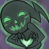
first of all i had the idea of wanting to show off my ink yokai's human form and true form in the same image. i had already drawn a nsfw picture of her true form, but i had this great mental image of what her human form would look like and wanted to draw it, plus i wanted to show off the difference in height and built. she's short and tiny as a human--and tall and beefy as a monster.
the composition itself is nothing revolutionary--but it doesn't always need to be, and i was relying on my plans for the colouring style to make the picture look interesting and eye-catching. in the rough and refined sketches you can see how i work out the anatomy with finer and finer lines, until i'm ready to do the lineart, at which stage i add more texture and details. i wanted this picture to look symmetrical but organic, so i didn't want to just draw the left side and then copy-past it mirrored on the right--it's a great method for more stylised stuff, but for this particular image it would have looked a bit stiff and stale. the only thing i mirrored was the arms (as in, i selected the arms on the left side, copied them, and flipped them horisontally), because i wanted them to be posed the same way on both sides--but i did the mirroring at the sketch stage only. at the lineart stage, i drew both sides 'individually,' so there's still some variation to the lines and details.
i knew from the start that the lower half of her true form would fade into white and be covered in whisps of smoke/mist, but i still outlined her legs in the lineart, and added some colour to them while adding the basic flats and gradients. this was partly to ensure the anatomy came out looking correct, and partly because it thought it would look better if at least the outline of her legs were sort of visible through the smoke, as opposed to her body just fading into a complete nothing below the hips.

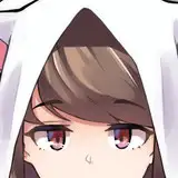
her true form's colour scheme is based on ink on paper, and it's got some yellow and brownish undertones. but for some reason i wanted her human form to be a bit more monochrome greyscale, regardless of the lighting of her surroundings. it would be one of those stylistic choices where she'd always be drawn in black, grey, and white, no matter how colourful her surroundings and the people around her might be. in a way, her human form is supposed to come off as more creepy and unnerving than her true form.
i added the flats and basic gradients, using the lasso select + airbrush method. i wanted the end product to look a bit like a faded, slightly yellowed greyscale photo, so i worked in almost greyscale colours entirely, figuring i'd adjust the colours towards the end of the process. i used a lot of neat brushes for this picture--in a sense, the whole vibe of this painting is dependant on the splotch brushes that look like splattered ink or ink stains. i used them to make the background vaguely resemble old, worn paper; on the human form's clothes (the idea is that her hands and feet and hair are constantly dripping with ink, which stains her clothes too); on the true form's arms and tail... and the smoke around their feet was done with a smoke brush, though my idea is rather that it should look like whisps of ink in water.
i ended up lowering the transparency of the original lineart to near invisible, and used a brush that imitates ink to add a kind of stylized lineart to parts of the picture--primarily the true form in the background. this was one of those pictures where i kept going back and forth on a lot of things... i would try something out, decide i didn't completely like the look of it, and end up re-doing it in a different way. the lineart is just one example. i also completely re-did the ink splothes on the human form's sleeves and hem, because the first time around i thought they looked too big and in-your-face. i tried rendering the fur on the true form's neck in a more painterly way, but i thought it didn't look super good with the style of the rest of the picture, so i ended up going for a much more simple and stylized look. at first i wanted the shape of the true form to look more dark and shadowy, but ended up changing my mind about that too, and for the longest while i couldn't decide exactly how sepia-toned the picture should or shouldn't be.
i coloured the true form at 'full contrast' at first, and then adjusted it to look a bit more faded, not least towards the bottom. not only did i want it to fade into the smoky stuff around their feet, i also wanted to distinguish between the two 'layers' of characters, with the true form in the background and the human form in the foreground. the human form is drawn with high contrasts, making her pop a bit from the spectral shape behind her. in contrast to the true form, the human form is almost lineart-less, though i used white lines to make her inky hair look dripping wet. i added some faint darker gradients behind her clothes and a pale gradient (and a "halo") behind her head, to sort of push the differences in value between foreground character and background character further apart, making the different parts of the image easier to read and distinguish from one another.
i added the finishing details--the smoke, the dripping ink, the human form's glinting eyes--and then adjusted the hue of the image. at first it was much more sepia-toned, but it didn't look quite right, so i changed it to a colder hue (that still has a faint yellow undertone rather than being completely grey) and bam, it's done.
// art + character © me.