A New Fresh Look for Our Menus’ Icons + A Little Bonus!
Added 2024-07-26 13:08:08 +0000 UTCHi there! It’s Chloe, here for today’s Patreon post. A few months ago, Alex tasked me with something I was not used to doing, but that I was game for: drawing custom icons for the game’s menus! So for this post, I will be showcasing the work that went into our revamp of the Build Mode menus and the Paramaker’s. This post is exclusive to Patreon, so please do not share it! Thank you!
Rethinking The Menus’ Organization
One of the first things we had to do before I set off to create all the Build Mode and the PAM icons was to re-think how the game’s objects were currently organized. Was it easy for the players to find what they wanted? Were some objects not in the right categories? Could we simplify the way every item was classified?
 Our old interface for the build mode catalog. Back when the chalet video, we didn’t have as many categories as we do now! The menus were cluttered with a lot of text, and that’s when we thought we needed some change.
While Sonia rethought how menus would work in the Paramaker, I focused on organising the Build Mode’s menus. Once that was done and we were satisfied, off I was to the drawing board!
Choosing Our Style For The Icons
Until now, we used icons from a website we were paying the rights for. However, it made it that sometimes, we couldn’t get a unified look for our different icons, since the icons on the website are done in many different styles and by different artists. We also needed some specific stuff, so we decided to start creating them in-house from now on. (Some icons that we didn’t make remain in the game, as placeholders for future icons, besides other reasons).
Before starting production for these, I did a few tests to ensure the look we wanted for the icons. We wanted something simple and cute, and that was easily readable.
 These are the first tests I did for the style of the icons.
I tried different brushes for different renders on the linework and also experimented with styles quickly. While some options were interesting, some didn’t work for the contexts the icons would be used in – 3D/isometric drawings work fine for furniture items, but not so much for the Paramaker!
 The next batch of test icons I did once we generally knew what we wanted.
Once we decided what we liked the best from the previous different tests, namely the sticker style, it was time to try illustrating a few icons for different Build Mode categories. At this stage, we were able to iron out some technical issues (such as the white lines all around the drawings!) and see what worked and didn’t work visually. Overall, we were happy with how these turned out, so I had to OK to move forward.
Creating Icons For The Build Mode And Paramaker
I decided on some details, like the width of the line work and the width of the stickers, before getting started! Since we were about to start the playtests for the Build Mode, I prioritised creating the icons for it. Overall, just for the Build Mode, I hashed out over 130 different illustrations.

We have everything covered with these! These are just for the Build Mode.

Here’s a closeup of a few of them. You can see a good variety: icons for specific furniture items, rooms, tools, paint, decor, etc!
Similarly, I created around 120 drawings for the Paramaker. Here are just a few!

This close-up view showcases a lot of different category types! Clothing, shoes, body pilosity, body types…
 This is what the icons look like in the Build Mode! I find them lighter on the eyes than the good old text menus we had before! Alex is the one who designed the interface around the icons I made!
 And here are the icons in the Paramaker menus! Alex made a quick version to resemble the Build Mode layout, but it is not the final look!
I look forward to creating more of the game’s icons! We also got to have people test out the new menus with the icons during our visit to Montreal Comic Con, and the feedback we got was very positive! I was happy to hear that our hard work had paid off.
A Little Bonus
Quite unrelated to today’s topic of choice, I also wanted to show some of the fun things Sonia and I created during our hack week. For those unfamiliar with our previous editions, it is a week that the team dedicates to working on features that aren’t a priority, but that we personally want to add to the game.
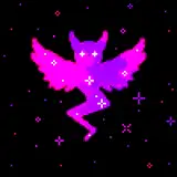
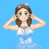
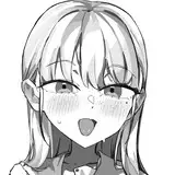
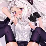
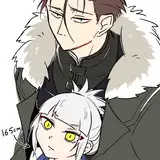
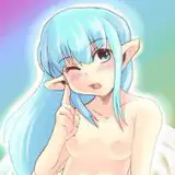
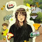
Sonia and I ended up working on things that correlated a bit. And so, I present to thee, to conclude the week… the expanded Miki cinematic universe.
 Both Sonia and I ended up creating more Miki-related items; here’s the collection so far. As the one who created Miki on a whim and as a fun poster in the game, I am quite happy to see how it’s starting to evolve and become…canon to our lore.
I hope you all enjoyed this week’s post, with my off-topic bonus feature! Have a nice one!
Chloé (・ω<)
Comments
wow thats neat
mollie
2024-11-14 14:51:09 +0000 UTCThe sticker style icons stood out to me the most, so I’m glad that’s what you went with! Love all the care and attention to detail going into every aspect!
Kayleigh
2024-09-06 16:47:33 +0000 UTCAs much as I love y'all being creative and innovative with your ideas, I hope you won't put too much focus on this whole anime-genre thingy. Reading it in combination with lore made me kinda cringe, I hope you'll stick to more traditional things. Like having some of it in the game, but it's definitely a little too special imo. I'd rather have your resources be spent on things like wind chimes, billard, fish tanks etc. than a body pillow tbh. This is too much, no offense.
Kayne
2024-08-29 21:56:14 +0000 UTCI'm gonna be honest, I love the new icons and as I was reading I was hoping you would go with the stickers. 😆 So I'm haiku that's the new direction for the icons. Also my Para is gonna have a Mikka obsession in the game like I've had a Sailor Moon obsession since I was like 12, haha.
Thaaeroprincess87
2024-08-20 07:22:10 +0000 UTCThe Miki items are so cute! I'm so happy to see the team starting to shape this game's personality and lore! I love to just sit and imagine the future, when gamers will come to make easter egg/lore explanation videos on youtube
Ariel O'gwin
2024-08-15 22:22:14 +0000 UTCim losing it over this, especially when you told someone congrats on not knowing what a body pillow is, and then link to an urbaN dictionAry definition of a DIFFERENT WORD that starts by saying "is a body pillow that" which suggests that not all body pillows are such. "a peanut is a nut that..." doesn't mean that all nuts are peanuts 💀
amongusfurry
2024-08-11 07:00:54 +0000 UTCI mean, as an East Asian who grown up in anime culture, I am pretty confident that I know more than urban dictionary. It's quite dismissive to accuse of me as someone who believes in fake news because I bring new cultural context to the table. You keep bringing up incels as if they are the only people who are in possession of body pillows, but the culture has moved beyond incels. I agree that it will be gross and inappropriate if it has a picture of half naked school girl, because that's child pornography, which is not the case. More and more people are approaching character pillows as if it was a suffed animal. I personally know a lot of woman, young and old, who has similar items. Idea that the pillows very existence means incel culture representation, would mean having animal stuffed toys should mean furry representation, right?
JJune
2024-08-09 16:35:23 +0000 UTCJJune don't feed the trolls ignore it.
Lucie Baha
2024-08-09 14:16:25 +0000 UTCIt's a schoolgirl. What kind of adult wants a human sized schoolgirl in their bedroom..? Sorry, in their bed. Would you like more sources than urban dictionary or everything that contains something you don't like is fake news - it's a time management question for me. At the end of the day, it's not mine or yours or the devs name on the line. It's Alex's and looking at this comment section a lot of people would love the game to take this route. Maybe showcase it for the next public yt video and see what other great things incels can suggest from their culture.
Space Giraffe
2024-08-09 05:45:01 +0000 UTCAre you grossed out by the existence of big pillows with people printed on or what people do with it? I can assure you that devs are not planning on making pornographic content for paralives and I hope you agree that with no sexual interaction it's just a pillow. Nowadays body pillow is not exclusively for incels and it's a major part of subculture. With that logic, stuffed animals or dolls shouldn't exist in the game either. I suggest you do more research than just an urban dictionary entry before you decide to share how much you are grossed out by things.
JJune
2024-08-09 05:27:07 +0000 UTCHi Lucie, congratulations on not knowing what a body pillow is, I am quite jealous. The character in game is wearing a schoolgirl uniform. Here's the rest of the riddle (it was well hidden): https://www.urbandictionary.com/define.php?term=dakimakuras
Space Giraffe
2024-08-09 05:20:23 +0000 UTCThere's nothing offensive about a body pillow and the character in the pillow is not provocative, so it's not offensive In addition to this, the team has said that there will be no offensive themes in the game.
Lucie Baha
2024-08-08 20:12:26 +0000 UTCIf you think paralives is a bad project, you need to get a grip.
Lucie Baha
2024-08-08 20:10:47 +0000 UTCNo, it's not just me, here's the link with the definition again : https://www.urbandictionary.com/define.php?term=dakimakuras
Space Giraffe
2024-08-07 04:18:02 +0000 UTCI think you're projecting a lot of what seems to be your own issues onto a pillow. It's a big pillow with a print on it. People like pillows because they like being comfortable while they sleep. If you make this about "crusty pillows", that's your own fantasy running wild.
Lianna
2024-08-06 17:28:35 +0000 UTCI like that it’s larger than some game menus. Sims menus are pretty cluttered too. I like it better than the original so far. I’m sure they will find ways to improve it
Katie
2024-08-05 16:17:05 +0000 UTCAnd, unfortunately, pornography is unavoidable online, the average age of a child first being exposed to it online is in single digits. Should we make sure Paralives computer screens include that? I'm fine with the crusty pillows staying since that might fligh over kids heads with a tongue in cheek caption, but please be sure any adult knows who uses them for what. I certainly have a new impression of the Paralives employees who made sure to invest their time into creating that out of free will. There's a lot of fun things in Japanese culture such as gorgeous figurines fans invest in. Pillows are for creeps. But hey, as I said, why not make the town incel 😂
Space Giraffe
2024-08-03 17:44:26 +0000 UTCIt would be worst to start masking part of subcultures just because they disgust some. I personally don't like body pillows but it's a fun addition and it's a thing that's inheritly part of the Vocaloid/anime/idols subcultures. Almost unavoidable I'd say as it's very common to see some in Japan
Ghislain Pedro
2024-08-03 09:42:31 +0000 UTCI like this. BUT. It is quite cluttered on the eyes still. Especially the build mode part. It's a little less cluttered in paramaker. But having to click through 5 different menus to reach what you want is quite, tasking
Kiiiwiii
2024-08-02 16:12:38 +0000 UTCI'm sure we'll all get used to the icons very quickly regardless of how we look at them. Personally, I always see the duck and have to look for the rabbit in that famous classic picture. :)
Fran Smith
2024-08-02 13:28:28 +0000 UTCYes, it looks a little like a hoodie to me too. :)
Fran Smith
2024-08-02 13:25:44 +0000 UTCAll due respect, I'm not 14 years old so the "it's just a pillow uwu" won't fly here. For anyone out of the loop, here's an explanation (spoiler alert, yes, it a p**n thing): https://www.urbandictionary.com/define.php?term=dakimakuras
Space Giraffe
2024-08-02 03:38:59 +0000 UTCwith all respect, body pillows are awesome! I have lots of friends that have a body pillow of their favorite characters, some are for jokes, some are just cuz they like the character, a lot of them just leave their body pillows in like, a chair in their bedroom, quite funny actually lol
Pvydrow
2024-08-02 02:36:36 +0000 UTCDefinitely grossed out by the bodypillow but I guess then we can create creepy incel characters
Space Giraffe
2024-08-01 16:47:24 +0000 UTCMiki fan ❤️❤️❤️ and I love the icons ❤️❤️❤️👍👍👍
Nathalie Carluccio
2024-08-01 07:40:53 +0000 UTCI love the Gradient icon style.
Alejandra Colunga Rogers
2024-07-31 18:29:42 +0000 UTCI'm already a Miki fan !
Joanie Boissonneault
2024-07-31 10:19:58 +0000 UTCWonderful, thank you!!
Kaitlyn Jackson
2024-07-30 23:50:46 +0000 UTCI think the more recent version fits the style of the game a lot more and falls more in line with all the other UI elements throughout other parts of the game
Pvydrow
2024-07-30 15:16:38 +0000 UTCI can't help it, the icons are nice but I'm still a fan of the more "serious" look of the first image. Nevermind, I'm sure this won't prevent me from enjoying the game when it comes out.
Chiara
2024-07-30 14:01:02 +0000 UTCEt les icônes sont parfaite bravo :)
KittyPara
2024-07-29 17:34:56 +0000 UTCJ'adore la collection de Miki ♥_♥
KittyPara
2024-07-29 17:32:22 +0000 UTCPerfect! 💚
mintyKHat
2024-07-29 16:07:33 +0000 UTCThanks for answering! Love your work!
Rodrigo Escribano
2024-07-29 14:12:08 +0000 UTCHi! We decided to have them crooked as a style choice since they are stickers and sometimes they aren't stuck all the same! The UI and menus are still being regularly tested with playtests and people from different backgrounds to see what needs changes and improving, so things like these are still subject to change :) Thanks for your input!
Chloé Ouellet
2024-07-29 14:05:22 +0000 UTCHello! Yes, it's a tentative category we are trying. They may end up merged later on in some menus. One category is hobbies/skills, which are items that can be used by Paras to level up their skills. In there, you'd have let's say, a treadmill and a piano. The other category is a clutter category - specifically linked to hobbies. For instance, that's where you'd find a decorative yoga mat, music sheets, etc!
Chloé Ouellet
2024-07-29 14:02:27 +0000 UTCYes, we have little tooltips that appear when you hover over the icons :)
Chloé Ouellet
2024-07-29 13:59:35 +0000 UTCHi! Thank you for your feedback! :) We have been testing and are still testing the UI and menus with playtesters from different backgrounds to find and tackle the big issues the UI has. The picture of the UI is extremely zoomed-in, and I have to admit it does look overwhelming in it! But in the game, I personally find it much less busy, since it doesn't take much space overall in the screen. Nonetheless, things are still being tested and are still up for change! Some tooltips pop up when you hover over an icon to tell you what category the icon is! That way, if you are unsure, it also helps a bit! :)
Chloé Ouellet
2024-07-29 13:59:05 +0000 UTCHi Jordan! Thank you for the suggestion! :) I will forward it to the team
Chloé Ouellet
2024-07-29 13:53:37 +0000 UTCHi! Do not worry, the names of the files (the image in the post) is not the names of the categories in the game! When I export this many files at once, sometimes typos slip in -- but these do not appear in the game, they are just visible on our end.
Chloé Ouellet
2024-07-29 13:52:08 +0000 UTCYes, that's what it does already :) It's easier that way for players
Chloé Ouellet
2024-07-29 13:51:13 +0000 UTCHi Amanda! Miki is a character I created that embodies Idol and Anime culture as a whole, so no it is not Hatsune Miku ahah, as much as the names are similar. I made the most generic anime girl I could think of, and picked a name at random! I didn't think of the similarity of the names Miku and Miki at the time, but at this point, the name has been shown and is on posters and all for the game, so we are rolling with it, ahah!
Chloé Ouellet
2024-07-29 13:50:10 +0000 UTCHello Alex! Yes, there is a pop-up when you hover over the icon to clarify what a category is if the icon isn't too clear :) Some categories are unique to our game, so the icon might not be familiar to all!
Chloé Ouellet
2024-07-29 13:47:25 +0000 UTCHi! We have been discussing options, all the UI in the game that has been shown previously is still subject to change :)
Chloé Ouellet
2024-07-29 13:45:56 +0000 UTCAhaha i see what you mean for the bikini top now that I'm looking at it with that in mind! In all cases, there will be a textbox pop up that will appear if you hover over an icon you aren't sure of; that way, it will help a bit too! For the terrain tools icons, seeing them in context definitely helps! When you see all the icons for the tool lined up, it becomes clearer. In all cases, all UI and menus are being tested by playtesters, so nothing is final!
Chloé Ouellet
2024-07-29 13:45:24 +0000 UTCOooh, a glowstick would be cool! It's a must-have for idol culture, ahah
Chloé Ouellet
2024-07-29 13:42:07 +0000 UTCHello! Yes, there is a textbox that pops up if you hover over the icon :) We are currently still discussing what we can do for accessibility, so thank you for your suggestion!
Chloé Ouellet
2024-07-29 13:41:22 +0000 UTCIt is just like Sehrys says, there is a search menu where you can easily search for specific items!
Chloé Ouellet
2024-07-29 13:39:55 +0000 UTCYes! When you hover over the category, descriptive text pops up :) that way if you aren't sure of an icon, you can always hover over to see what it is
Chloé Ouellet
2024-07-29 13:38:35 +0000 UTCin one of the pictures you can see in the build menu the bottom most icon is a magnifying glass, so i'm sure you can search :)
Sehrys
2024-07-29 12:40:01 +0000 UTCColor coding them (in some way) could be useful too
jaaama
2024-07-29 06:44:23 +0000 UTCAwesome!
Vash T
2024-07-29 04:40:23 +0000 UTCHello, I’m not sure if this is possible, could you make a custom/favourites or will it have a search bar? No pressure. Thank you
Rin Canono
2024-07-28 17:34:59 +0000 UTCI really like the sticker icons, they are very cute! Although, like someone else has suggested in the comments, maybe it would be nice if they were coloured? Or at least, when you go over them with your mouse, they become coloured?
Amy
2024-07-28 14:44:31 +0000 UTCIt’s their own version of a vocaloid pop star character, which is inspired by Hatsune Miku - so not the same thing. :)
Crystal Wilkinson
2024-07-28 09:27:22 +0000 UTCI definitely like the menus and the icons! 😀
John Bergstrom
2024-07-28 05:31:44 +0000 UTCHobbies and skills maybe, but i totally agree with you, it's kinda confusing.
Josephin01
2024-07-28 00:34:56 +0000 UTCI just posted the same thought! Text helps find things that have a more vague category sometimes.
mintyKHat
2024-07-27 18:39:10 +0000 UTCVery cute, though I have to say text can sometimes be useful when you are trying to find things. Unless I missed it, would it be possible to see the category in "alt text" when hovering, maybe? Not 100% sure it's that necessary though so I definitely wouldn't spend too much time worrying about it. I'm sure randomly clicking will also allow a user to eventually orient themselves to where everything is! 💚
mintyKHat
2024-07-27 18:37:34 +0000 UTCI love these icons, it makes the look of the game more intuitive
sofst
2024-07-27 17:03:51 +0000 UTCI agree with this! or highlight when the mouse waver on it?
sofst
2024-07-27 17:03:43 +0000 UTCI really like the new icons! Would it be possible to make them straight instead of slightly inclined in the Build Mode? I think they're much more legible that way, like in the PAM. That might also help with the ADHD some other comments are mentioning.
Rodrigo Escribano
2024-07-27 12:27:15 +0000 UTCI do agree with you a little bit. Some of the icons are naturally harder to understand (like the bookcase which does kinda look like a window). I wonder if there could be an option to enable/disable a description of each category. I know that's a lot of extra effort, but for some people it would definitely help a lot!
mel_diamonddove
2024-07-27 11:00:57 +0000 UTCI like the new icons! The only thing I would suggest would be colouring the icons (even just a single flat colour for each) to make it easier to scan through the sections quickly.
Impish
2024-07-27 03:50:41 +0000 UTCI loved it! Simple and cute💚
pekeniax
2024-07-27 02:19:20 +0000 UTCHatsune Miku, it's an Anime Charakter.
Josephin01
2024-07-27 01:15:18 +0000 UTCthese are awesome, fantastic job with the design! only one thing confused me - there seem to be two hobby items sections, one of which has a barbell as a symbol for exercise equipment (i assume). but the other hobby icon has a subcategory with a barbell? it's confusing 😅
Sehrys
2024-07-26 23:11:20 +0000 UTCI love the icons and they fit well with the style of the game. :) Miki lore is cute too. :)
Christina Ozeki
2024-07-26 22:00:05 +0000 UTCThis looks phenomenal! One question though: When we hover over each sticker in the UI, will we be able to see a little text bubble pop up near the sticker stating specifically what each category is? I think that would be really helpful for those of us (specifically me, lol) who would frequently second guess which category is which when not given their specific names. Keep up the amazing work, team! ❤️
Kaitlyn Jackson
2024-07-26 21:26:15 +0000 UTCUI looks very simple to read love it!
KishaE
2024-07-26 20:28:25 +0000 UTCI love everything ❤️
Melanie Engelbrecht
2024-07-26 19:36:48 +0000 UTCI love the UI, but more importantly, I love the extra Miki merch and cosplay outfit and hair!
illykitty
2024-07-26 19:34:14 +0000 UTCI think this new interface is actually really distracting and harder to navigate than the previous one. 😩 It feels extremely cluttered and the white with cartoony linework makes it hard to focus. While looking at the post I had to scan everything multiple times to find what I was looking for. I had to squint to tell what was going on in some of the icons as well, such as the thing between the chair and the lamp… is that a bookcase or a window? Maybe it’s because I have ADHD and find it hard to focus on just one thing. A clean, simple interface feels smoother to navigate and is much less distracting, whereas a busy one detracts from the aesthetic of the game, feels very obtrusive, and is hard to navigate. The gradient and glyph styles look a lot nicer and feel less distracting to me. I like what another poster said about making the active selection brighter somehow. Reducing the opacity of the entire interface may help it feel less obtrusive, and then whatever you’ve selected can become full opacity. You guys are doing amazing work, and I cannot wait for this game, but I think it’s important to get feedback on things like this. Maybe I’m the only one who thinks this 🤣
LapeyLou
2024-07-26 18:41:04 +0000 UTCThank you very much!!! :D
Sawachii
2024-07-26 18:38:16 +0000 UTClove the sticker icons! they really add to the more artistic style of the overall game
madelyn
2024-07-26 18:35:44 +0000 UTCI could cry I'm so happy with everything about this game!!
greeneyedsims
2024-07-26 17:41:28 +0000 UTCThanks for sharing! It's something we'll keep in mind when we'll discuss accessibility features :)
Chloé Ouellet
2024-07-26 17:38:39 +0000 UTCWow! What amazing developments! The UI looks really smooth! All I ask is for automatic roofing when you guys start developing more on the Building aspect 😂 I miss that feature in Sims.
queentowwy
2024-07-26 17:36:10 +0000 UTCI really like this idea!
Jazz
2024-07-26 17:36:03 +0000 UTCSo happy it looks like this right now. The old UI was really ugly so this is a big improvement!
Tobias
2024-07-26 17:25:30 +0000 UTCI really like how the UI has developed! I wonder if it might be nice if the menus that are not in use were dimmer so that the active submenu was a bit clearer visually. For example, in the pic that shows the musical instruments, the menus above the one for specific hobby items would be a bit darker, so the active menu sticks out a little more.
Jordan
2024-07-26 17:06:28 +0000 UTCSo cool 😎
Sláine Sheils
2024-07-26 17:02:47 +0000 UTCCan you make a dark mode for the icons or have some appearance settings? Like invert the white and black in the icons or customize the ui palette. I have keratoconus and it's difficult for me to see bright colors. Would really appreciate this as an option ♡♡
Sawachii
2024-07-26 16:54:41 +0000 UTCMiki needs a cute animal sidekick. Maybe a miniature man-eating monster.
Vera Ohlsen
2024-07-26 16:51:19 +0000 UTCThey have confirmed tooltips I think
Maxx
2024-07-26 16:22:28 +0000 UTCWhen I saw the new interface in the recent post I immediately fell in LOVE and ADORATION with it. The icons are so cute and I love how they are "crooked". That, the design of the icons and the colorful backgrounds make the whole interface so adorable, cozy and fun! Its amazing what UI style alone does for a game. I knew you guys were gonna rework the interface but yall, as always, blew it out of the park! Early Access cant come soon enough
Maxx
2024-07-26 16:20:31 +0000 UTComg i fw paper dolls so hard as a kid! sometimes i miss how easily accessible they once were
Laurrel
2024-07-26 16:15:08 +0000 UTCyeah my favorite dinamic the hack week!
Joel Jimenez
2024-07-26 16:09:38 +0000 UTCEspecially with those two looking so similar and confusing
Court12413
2024-07-26 15:48:59 +0000 UTCI was going to ask something like this, too. I absolutely love the icons but it would be great to at least have the option to have text, too (even if it's just when you hover over the icon) - I'm notoriously bad at remembering which symbol stands for which category!
Alex J.
2024-07-26 15:37:18 +0000 UTCYeah I can see the bikini top but for whatever reason it shall looks like a strange hoodie when I first look at it. Then I'll blink and see the bikini top
Sarah Maver
2024-07-26 15:33:19 +0000 UTCI think this is perfect and unique for the game! I love miki and maybe she will be the npc music artist that my paras go to see in concert!!
Maxayn Henderson
2024-07-26 15:32:47 +0000 UTCI really like the new icons, i always felt that a more notebook kind of style would work with the game. The icons look like you would put them in a bullet journal of some kind. I also like the colorful tabs.
Carelle
2024-07-26 15:30:23 +0000 UTCThese look great! Just want to point out a couple of misspellings in the zoomed-in icons ("decoreative" and "personnality") that you should probably fix. I know they're not seen by players, but if you want your files to sort A-Z correctly and be easy to search for by staff, it would be better to have no typos. (Sorry, my work involves proofreading and I can't turn it off...)
Nina
2024-07-26 15:26:56 +0000 UTCLove the icons— I’m hoping the name of the category pops up when hovering over them, just for additional user experience :)
LightDeficient
2024-07-26 15:24:05 +0000 UTCnot to out myself as being totally out of the loop but who is miki?? she looks adorbs!
amanda bear
2024-07-26 15:21:58 +0000 UTCThe icons are so cute! and Miki is so adorable! I love pink and cute stuff! 🥰
PinkRosie
2024-07-26 15:21:51 +0000 UTCOh this RULES. I love the sticker look to the icons!! And the slight tilt they have in the menu adds so much character. The new menu designs are so clean and I think much more unique to the game. You guys are doing a wonderful job coming up with ui designs that’ll make it immediately recognizable as paralives
Rosirose
2024-07-26 15:15:42 +0000 UTCWill icons show what they are when you hover over them? Most are self explanatory but in the build mode image shown under assumig the office category, the one selected seems like a hobby/skill building section. It shows an easel and guitar. In that category it shows a paint palette and a dumbbell. In the unselected category next to it, it also looks like a hobby/skill section and its icon also has a paint palette and dumbbell. I would probably get confused on where I needed to look for stuff when they have the same items pictured
Court12413
2024-07-26 15:09:30 +0000 UTCI love that you guys take time to create purely for the fun of it. The passion we see you all putting into this game always gets me emotional.
Xo.Noe
2024-07-26 14:55:49 +0000 UTCThe look and style of the icons are so cute. I really like them! ♡ and Miki?.. I don't know how to explain it... I LOVE IT. So sweet and funny and surprising. I just didn't expect this. This is my personal highlight of the post. Please don't get me wrong, the icons are great!
Josephin01
2024-07-26 14:46:00 +0000 UTCFor the bikini top, I think it's because of the "hole" between the straps.
ladyteruki
2024-07-26 14:33:35 +0000 UTCThe icons look wonderful! 👍🏻
AlexArt
2024-07-26 14:20:55 +0000 UTCThis is really cool! I love how Paralives UI design are approaching some sketch line style, it kind of pass the idea the player is planing the storytelling from a scketchbook! Although is early to ask, do you guys plan to create a more visual style for the relationship menu, or the needs and wants too? I apreciate the way it shows parafolk's thoughts, but along the time, so much text can be a bit tiring to pay attention (still, It's ok if this isn't supose to change much, I already love all of it ❤)
Millena Xavier
2024-07-26 14:19:04 +0000 UTCAs someone who has the high artistic non-talent capability of drawing stick people, these look great! I actually thought the sticker was most suited to the game and was delighted to see that was the one you chose! As does all the art in this wonderful game, the style looks absolutely wonderful to me! But also as a stick people drawing level non-talent, I also puzzled at a couple of them, purely from a functional user view: * the "Illcons flatten terrain" icon, I thought looked more like floor placement tool. I think it might look more like a "flatten terrain" tool icon if the icon had a bit of a hill that looked like it was being flattened, instead of just a line. I play a few other full-on world building games with a "flatten terrain" tool and they have a kind of hilly bit that looks like it's being flattened. I hope this makes sense. *also, I might be completely dense and looking at this particularly icon in completely the wrong way (I probably am, particularly with regard to my ...artistic...non-talent), but the "Illcons bikini top" in the next black and write picture doesn't look like bikini tops to me. I'm not sure what it looks like. Perhaps I really am dense and there's something there I'm not seeing. I don't mention this to criticise, (particularly since I'm quite visual art illiterate), more precisely because I'm a complete drawing non-talent, and thus representative of a lot of other visually non-talented people who might also enjoy this game, lol! So I'm thinking that other people might see these in a similar light. So in the interests of avoiding icon obfuscation, I thought I'd mention my personal puzzlement for your consideration, just in case I'm not alone in my visual art idiocy. :-))) I might add that all the other icons made complete sense to me. :-))
Fran Smith
2024-07-26 14:16:47 +0000 UTCI smile really big every Friday! Keep up the great work! Miki, the icon she is already
Jordan Harrison
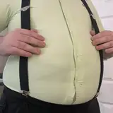
2024-07-26 14:15:51 +0000 UTCThe body pillow is so funny and cool
Nathan Carpenter
2024-07-26 14:14:24 +0000 UTCI'm loving the 'cut-out' style of the icons! I'm not sure why, but they remind me of paper cut-out dolls, clothes, and furniture I played with as a child. Love it!
tey711
2024-07-26 14:13:26 +0000 UTCComplete agreement, the UI seems to me like it takes up quite a bit of space for a limited benefit. The breadcrumbs are a great suggestion, especially now with the icons, it doesn't have to be as long as a url. Maybe the outline of the icons could even use the color scheme in order to mirror some elements from the UI.
ladyteruki
2024-07-26 14:13:02 +0000 UTCI LOVE the style of the icons. My eye kept going back to it when I was looking at all the others, so I was extra excited to see that's what you went with. They look great!! Also, Miki is bad @$$. The wiafu pillow made me giggle, but seriously it looks awesome. 👏👏👏
Madragal
2024-07-26 14:12:19 +0000 UTCTotally, I felt the same way that when I look rabbits or Henry Puffer on the sims, This kind of stuff is one of those things that make you fall in love with the game
manuprieto
2024-07-26 14:12:01 +0000 UTCHi Chloe ! It's so cool to see all the variations you studied before landing on the final style for these icons, thanks for showing us these steps ! These icons are really cool, and given how many there are (and counting !), their readability is a testament to how well you designed them. It's also very interesting to see what is a category (...decorative windows ? interesting that there's a distinction, would that imply that some windows have functionalities the decorative ones don't ? or are some resizeable but not others ?) (Hotsuni ?) Miki looks fun ; this type of content is not usually my cup of tea, but at the same time I'm really happy that we're seeing "lines" of products around certain themes. It's the sign that we're slowly having a good number of basics, and can move on to more unique items ! Of course this was during hack week, so it was a bit out of the ordinary, but still, what a fun project. May I suggest a glowstick of some kind for another time ? When Miki holds surprise concerts in the park, obviously fans will want to come and cheer with their Miki merch XD
ladyteruki
2024-07-26 14:11:16 +0000 UTCAnd I loved the Miki stuff! This kind of lore is what makes a game something special.
Panthro Samah
2024-07-26 14:07:51 +0000 UTCVery good work. I have one question and one suggestion: - Question: There will be a text box with the name of the category if we wait a little over the icon? I think it would be cool if you don't know what that section is. - Suggestion: For people that are colorblind could be useful if you made an option to change the interface color to black and white. Instead of red, yellow and green messages about the para's needs, you could have different shades of gray. I understand that it could be implemented during early access, but I believe it would be a simple alternative that would increase the game's accessibility.
Panthro Samah
2024-07-26 14:06:16 +0000 UTCThank you for the feedback! We are currently having the UI tested by playtesters to make sure they find it easy to navigate and all, and we will iterate as we go depending on the feedback! so things are still subject to change, and I will forward your idea to the rest of the team :)
Chloé Ouellet
2024-07-26 14:00:28 +0000 UTCThe icons look great!!! I know nothing is finalized, but from a UI design perspective I feel like the multiple long rows of icons in the Build Mode interface a bit confusing, distracting, and cluttered. Have you considered something like a breadcrumb? For instance you see the top row of items showing room types, but once you click on office the office icon snaps to the left and hides the rest, revealing the types of office furniture on the same row. Repeat for granular subsections. You'd obviously need some sort of 'Back' button to reveal the rest of the furniture types, room types, and other nested sections. I think this type of approach could really clean up the interface, which could also benefit people playing on smaller screens. Just my two cents, but everything looks fantastic as always!
tahirah
2024-07-26 13:56:52 +0000 UTCI see the phrase "hack week" and I instantly get SO excited!! MIKI!!! I love lore!!! Thank you so much for sharing the icon development process! They look great, and as everyone else has said, a perfect complement to the game's style!
Lane Brettschneider
2024-07-26 13:41:55 +0000 UTCThankyou Alex!!! 🥰
Becky
2024-07-26 13:36:32 +0000 UTCI did Chloe you made my day!! 🤗 Thankyou!!
Becky
2024-07-26 13:36:10 +0000 UTCAmazing work team, love every addition you add every post!
Madisyn Brandt
2024-07-26 13:33:28 +0000 UTCBeautiful as always !!! 🩷
Vari_Ares
2024-07-26 13:32:34 +0000 UTCHappy birthday Becky!!!!
Alex Massé
2024-07-26 13:30:44 +0000 UTCLove the hack week expo!!
Charles Follett
2024-07-26 13:30:37 +0000 UTCThe icons look great! Love the style you went with. And Miki is an icon 🙌🏾
Tinsley
2024-07-26 13:28:19 +0000 UTCHappy birthday!! Glad you enjoyed the post :)
Chloé Ouellet
2024-07-26 13:27:07 +0000 UTCIt’s my birthday today 🥰🥳 so this has made my day hehe! Thankyou devs, love you all !! 💕
Becky
2024-07-26 13:24:19 +0000 UTCOh wow! The icons look simple yet informative! I’ve always chosen the simplest icon pack for my phone, and we have it for our future game, how lovely! Cheers for that Chloé
Andie
2024-07-26 13:24:11 +0000 UTCOmg I'm honestly so happy that Miki exists! I know it's not the main topic of the post, but I think that Miki is such a cool little thing that makes the lore something really believable. I'm excited for how this little character is gonna be used in the lore 👀 But also I love the icon style! The sticker look is really nice and fits the overall aesthetics very well. I can tell immediately what everything stands for. Really good job!
lias
2024-07-26 13:23:34 +0000 UTCThose changes were key! I love the new version
Una_simple_ kpoper
2024-07-26 13:23:06 +0000 UTCLove the icons!! They're really easy to figure out and look so cute and in style with the art style. 😍
Trisha
2024-07-26 13:22:16 +0000 UTCOMG, the icons look SO good 😊 very pretty to look at too
RomanEmpiree339
2024-07-26 13:21:28 +0000 UTCthe sticker style stuck out to me in the options, i love that it was chosen!! great work! ◡̈
Lauren Belcher
2024-07-26 13:18:52 +0000 UTCI love this and how simple it's all categorized!
BreakingGaia
2024-07-26 13:18:41 +0000 UTCLove the style of icon you guys went with, it's adorable. Can't wait for the Miki concerts.
Camilla Fontana
2024-07-26 13:16:52 +0000 UTCI can't wait for Miki Expo 2025! (And I really love the icons you did, great job!!)
Danny Juforier
2024-07-26 13:13:36 +0000 UTCThis is soooo good! I love the style for this.
SimplyDeeSims
2024-07-26 13:10:58 +0000 UTC