Hello! Some updates- Prints are just going out for February and March because I've been waiting for Patreon to respond to my request for the lists of patrons for those months since I am unable to download the correct lists on my side right now. They finally got back to me last wednesday, I've got everyone's packages ready to go, thank you for your patience!
Patreon has said their subscription UI has been broken since November and that they are working on a solution on the back end and they will personally compile all the lists for me while they wait for the UI to be rebuilt...so I am at the mercy of a few very nice people at Patreon sending me these lists.
In the meantime, here's the breakdown for March's Riso subscription print, the Lord of the Rings Two Towers print!
 Since my pink drum has been broken, I had to print these on my friend Karina's two drum machine at their downtown LA Studio - you can find out more about their studio at @strangeandunusual.design! It was awesome getting to print with Karina while I was waiting for my pink to be fixed, honestly knowing they're nearby was such a relief.
Technician visit for pink drum - $400 down the hole.
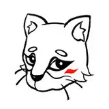
I finally found out what happened to my pink drum- since the ink has moisture in it and I think I let my confidential masters sit for too long, the chip inside that reads the ink color had corroded with rust, so it would no longer read the ink going into the machine! Confidential masters are when I seal the drum with a completely blank master instead of keeping an old image on the drum, letting air into the drum. Here'a a picture of what my fluo pink drum chip looked like vs a new one!
 Hopefully that hasn't happened to all my drums but my technician says it probably has. Womp womp...we'll cross that bridge when the drums stop working in the machine. If you need a tech in LA please ask me!
But the good news is my pink is back in production and I'm getting a two-drum machine (MZ770) literally tomorrow!! So I will finally have a backup machine when the other is having issues. This means prints coming out faster and on time...as soon as patreon gets back to me about the lists and fixes it's broken UI system. But I'm so thankful to be able to make prints for you all and share the process...sometimes things are just sticky. Thank you endlessly for your patience while I get all these moving parts in order!
This print was made with a combination of Yellow, Fluorescent Pink & Blue ~ the same color palette as February's print, just with a LOT more yellow to get those super juicy greens. I love seeing the range this palette can do, since it's a classic primary color palette and can mix to make most print colors. Sometimes I do miss black, but I think if I ever do add a dark value (the K in CMYK) into the mix then I'd actually add either a brown or a burgundy so I can control the color temperature of the darkest colors. If I wanted I could add a bit more blue to the brown make the print an overall cooler temperature, but still have the warmth of that original deep brown or burgundy. It'd be a nice way to harmonize any piece. It'd be very easy to add that 4th color when I get the two drum machine! Right now I'm printing every piece 3x through the machine...with the two drum machine I'll print every piece only twice. So much less back labor!
One cool thing about the two drum machine is it's actually significantly easier to print the three colors now, since I don't really have to watch the first color (usually yellow) as it comes out of the machine. The only place where I really need to watch the colors as they come out of the machine would be when I print my pink and blue print at once, on top of the yellow. I can register the pink and blue together and just adjust each color in tandem as things move around while printing. This will also help significantly SIGNIFICANTLYYYY with roller marks, since the rollers will only ever be grabbing yellow ink, instead of grabbing the yellow and pink ink on the paper, which is what happens now.
 One thing I loved about this piece was figuring out how to make Gandalf and Éowyn's clothing feel almost white, but nuanced enough next to one another that they looked interesting and not like a total void in the middle of the piece. Using a combination of subtle 15% fills and gradients I think I solved the issue. It was definitely not something I thought about until I started coloring, realizing what a mistake I'd made putting them together. I ended up really loving the horseshoe of greens and browns grouped at the bottom of the piece, with the whites and bright colors clustered in the center-top.
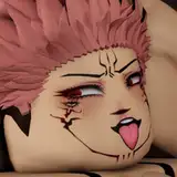
 Gimli's beard and the eye of Sauron also really came out incredibly in this piece. The combination of 100% yellow and like 75% fluorescent pink creates this insanely bright orange that I was struggling to get in the first pass. The yellow and pink weren't bright enough, but after some slight color adjusting and doing another pass with 50% darker values of both colors I was able to land on what I wanted.
 Sketch vs Final line
 I like to start with loose character studies of the characters as I'm watching the films, and then link them all together by overlapping them and putting them in dynamic poses where they're interacting with one another. I like to make lots of scratchy line art to build general shapes of the characters, and then slowly carve into the line with an eraser tool to find the pose and character details that I find most interesting. Sometimes that sketchy layer makes shapes I wouldn't normally gravitate towards, so it really helps open my mind to new stylizations too. Here's the final line!

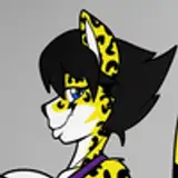
I think I started with Gimli for this piece...I always start with Gimli haha.
After my line art is finished I like to jump into flats, which is basically making the core shapes of each color so I can reference each piece later. For example, take Gollum's loin cloth LOL. I'll color in the entire loin cloth on Gollum in the flats layer, then I'll grab that shape over and over again with the magic wand tool to build the color to it. Here's a little example!

you can't see it too well in the photo but the loin cloth is selected every time! I just bucket tool fill in the color into the layers each time. Speaking of layers, here's the full color breakdown:
 quick tip! I've been doubling my pink, yellow, and blue layers before sending them to the machine and I thought it was really just my machine but I had to do it for Karina's machine too! the values keep their structure if all three colors get the same double treatment. It makes for a juicier print that matches my color mock-up better!
Patrons who paid between 2/2/2025-3/1/2025 will be getting these prints in the mail soon!
Here are some more close ups!


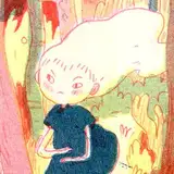
 SAMMMMM!!! really love this Sam.
Thanks for reading!! xoxo nat
Tyler Elmore
2025-05-07 18:42:14 +0000 UTCErin
2025-04-30 08:04:14 +0000 UTC