Hey folks, I wanted to see if you had any feedback on this early work for the new UI. What do you think?
A few things to note:
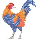
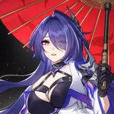
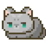
- I'm not actually going to change the colors of the art for any old pieces, but once the new UI is released all pieces that come after that will have a darker art theme similar to what's pictured on the left. So I just inverted those two to get an idea of what that art will look like on the site.
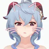
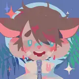
- The hearts are how you can toggle a piece as a "favorite." Red means it's a favorite, white means it's not.
- The tags pictured here just placeholders.
- The dots will open a menu for that piece so you can share it, and probably more in the future.
I'd love to hear any feedback you have, even if you don't like it. There will almost certainly be some tweaking of spacing or colors regardless of the feedback, so I don't expect this to look exactly like the final result. Thanks!
Phil Langlois
2019-06-09 19:55:23 +0000 UTC