Making Eyes! 4 Essential Tips to Address Common Mistakes
Added 2023-09-19 20:01:48 +0000 UTC
Hey everyone,
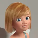
I often mention that eyes are the window to the soul, playing a major role in character design. They're how viewers connect with a character's motivations and emotions. Mistakes like poor proportioning or detail overload can really weaken that connection. In this article, I'll give you some essential insights and tips to get it right.
Basic Anatomy and Proportions
Before we dive into the tips, let's clarify some basic information for those not familiar with eyes as such.
- The Eye Structure: An eye is made up of several components, the sclera (the white part), the iris (colored part), and the pupil (the dark center). Understanding these can help you when adding details or lighting.
- Proportions: In traditional anatomical terms, the distance between two eyes should be about the width of one eye. Likewise, the size of the iris and pupil should be proportionate to the overall eye size to create a look that resembles real human anatomy
Expression
A valid question is why eyes are such a strong way to convey emotion. Here are some basic fundamentals and their meanings:
- The Role of Eyebrows: Eyebrows can dramatically change the emotion conveyed. Raised eyebrows can indicate surprise, while furrowed brows often show anger or concentration.
- Eye Shape and Size: The shape of the eye can imply various things. Larger, rounder eyes often make a character appear younger or more innocent, while smaller or slanted eyes could indicate a more serious or older character.
- Pupil/Iris Dynamics: The size of the pupil can be used to subtly express emotion. A dilated pupil might indicate excitement or fear, whereas a contracted pupil could imply focus or suspicion.
Different Styles
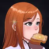
As you may know, my style is not strictly realistic; it's a blend of realism, cartoon and anime influence. This style I find particularly attractive due to the larger eyes, which bring more expression to the table. Nevertheless, here are some other popular styles:
- Realistic: Aim to emulate actual human anatomy by using shadows and highlights to create a 3D effect. Studying real eyes can offer insights into how light interacts with the eye's anatomy, adding depth and realism.
- Cartoonish: Focus on emphasizing expression over detail. Use bold lines and simplified shapes like oversized pupils or simple dots to convey emotion effectively.
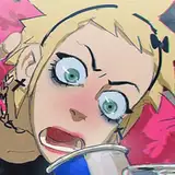
- Anime/Manga: Known for their exaggerated eye size filled with intricate details. Incorporate multiple light reflections in the iris and use gradient shading techniques to create depth and emotion.
- Other Unique Styles: These styles are about distinctive and original interpretations. You might experiment with non-traditional shapes, patterns, or placements, drawing inspiration from art movements like cubism or abstract styles.
Common Mistakes and How to Avoid Them
Now that we have a bit of context on the importance of eyes, let's address three fundamental issues most artists make, along with some straightforward technical tips.
- Proportion Mistakes: Often, artists draw eyes either too close together or too far apart, disrupting the character's facial harmony. This varies depending on how realistic you want your character to look.
Tip Solution: If you're aiming for a more realistic appearance, use the "one eye-width apart" rule as a general guide. When sketching, you can place a 'ghost eye' as a spacing marker between the two actual eyes.
- Detail Overload: Adding too many details like reflections or eyelashes can overwhelm the eye, making it look less natural.
Tip Solution: Less is more. Make one small bright light point with a hard edge right between the iris and the pupil. This will not only suggest how the surface of the eye reflects light, adding a layer of realism, but also evoke emotion. For instance, the more little white points you add, the more 'emotional' it might look, like when a character is about to cry. But again, be careful with the overload.
- Inconsistency: Sometimes the eyes may look like they belong to different faces, causing an unsettling effect. This happens to me more often than I would like to admit.
Tip Solution: Always draw both eyes in one go, constantly comparing them for symmetry and proportion. If you're working digitally, flip your canvas horizontally to catch any imbalances. If you still struggle, just duplicate one of the eyes, flip it, and deform it a bit so it doesn't look like an exact copy of the other.
One last tip about inconsistency in terms of the iris: Here's a simple tip I gave to a patron who was having trouble with the roundness of the eyeballs. You can address this issue using the 'Elliptical Marquee Tool' in Photoshop.
1. Hold Shift while you create the circle to make it perfectly proportioned.
2. Fill it in with black.
3. Reduce the selection by a few pixels (Select -> Modify -> Contract), maybe 2 or more, depending on how thick you want the line to be.
4. Erase the reduced selection.
5. As an extra step, select the layer again, press Control-T, right-click, and consider distorting it a bit using the Warp tool to make it look more authentic.
Conclusion
While eyes occupy a relatively small part of a character's anatomy, they are usually the first thing viewers notice. They're like a silent language, conveying the character's emotions and intentions. Getting the basics right in eye building like anatomy, style, and common mistakes to avoid is crucial for creating characters that resonate with an audience.
If you've found this article useful and want to explore ways to bring more life into your characters, take a look at this article Capturing the Energy and Expression in Character Design :D
.
Tomorrow, I'll be sharing the process video of this piece along with the files and more tips about this subject. They will be available for Mastering Maestro tier and above. Feel free to upgrade if this tickles your fancy! ;)
Welcome to all new patrons!. Drop any questions here in the comments, via DMs here on Patreon, or in our Discord group. I'll be more than happy to answer and track your progress.
If you found this article useful, please drop a like or a comment! I appreciate the feedback and criticism as well, as I strive to improve and provide you with the best.
For more information, check out our Patreon FAQ: https://ramonn90.myportfolio.com/faq and Patreon Catalogue: https://ramonn90.myportfolio.com/work
Your support makes this content possible! Thank you.