XaiJu
zpico
zpico

patreon


Ghosts


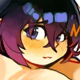
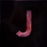
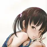
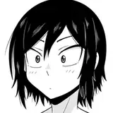
They look dead? lmao-

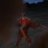
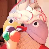
Nah it just seems very...spiritual. It's like I had drawn a tragedy, I don't know why I always go for something sad and dramatic when I think "big picture"  ._.

It's like the picture was color reversed! Also, sorry I keep doing very large pictures that you can't enjoy because you can't tilt your phone on Patreon, but I like it so muuuch- 

It's because I secretly hope that one day, after the story had unfolded, someone use it on YouTube to make a playlist that makes them think of the story lol. 

---

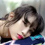
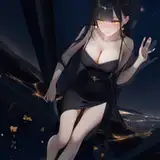
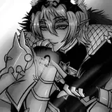
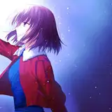
I wanted to do something more interesting with the original sketch posted a few months ago, so here it is. In fact I'm looking for a new cover for the comic on Tapas... what do you think? I mean for real. There are a lot of details/lines here, I'm afraid it looks like shit if it's too small. 

I see all those  eye-catching BL covers  and there's mine, barely readable lol. I don't know what I should go for....  

If I was reading BLs would I click on this image? Probably not -

---

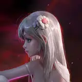
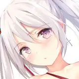
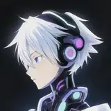
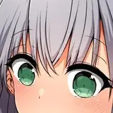
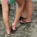
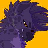
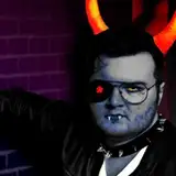
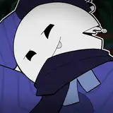
Basically Tera is masked but he looks good without it so, have both versions!


And I really need to go back to the comic cause I'd like to do 9 pages instead of 8, or it would cut a scene and that'd be very annoying- 

Wish me luck!!!


Love you


Ghosts Ghosts

Comments

Me and my damn slow brain... took me that long to recognize... Dec. 6.,2020 "Tendresse" ! It came out incredibly beautiful!

Mellowcat

It’s so hard to compare those two artworks/covers. Your current cover on Tapas (TC) caught my eye immediately, because it’s so unique and different for content labeled “BL”. (To be fair – I don’t like content labels, because in my opinion, if something is a wholesome complex story and not even finished yet – good luck with putting a simple label on it!). I was totally drawn to it and needed to click to see and know more! I hoped for more of what I “see” in the picture and the vibe it has, and that it hopefully won’t be just “clickbait” like in one interesting artwork but a soft story about (simply put) “boy meets boy” behind it. The TC is dark (not just color-wise) and has a certain matching vibe to it. Tera in full gear is so damn interesting (not your usual clothing) and his stance is just as promising as the boy’s facial expression. I can feel those two. There’s chemistry between them and me as onlooker. There are 9 visible “random” people around those two, and at least 7 of them are facing away from those two in the center. I remember, you once said it kinda looks like an apocalypse is going on and people might be in a hurry. To me it looks like an everyday busy sidewalk in the middle of town or close to a train station during rush hour. People are going on about their business, not focusing on those two in the center. That fact is somewhat adding to the feeling that it’s about them against the world. Them against the rest. They have their own struggle in everyday life. The world doesn’t stop for them. I’m comparing from my old notes, so this impression has nothing much to do with the story development to its’ current point. I think it might be more “helpful” to go from back then than it would be from the current story point. I know a lot more now than I did first time seeing the cover and deciding to give it a try (best reading decision ever, no regrets!). The backpack the boy is carrying seemed like a promise too. Either ready to run away and/or heavy burdened. He has something to say, since he’s directly looking at “you”. Tera on the other hand looks like the center of it all. His stance is not aggressive – but ready to take action any second – yet it looks like he could stand like that forever, shielding the boy and what he has to carry. The masked face is a hint that he’s not playing by the rules in doing so (otherwise he could be with official authorities in his tactical gear, like military or police). So yeah… that made me so curious and got to me. The thrill and hope for a good interesting read, which – as the icing on the cake - has an outstanding artwork. “Wait, what? I need to see that! I want to know more!” – I think that sums it up. Your current artwork is beautiful. Breathtaking and well done, an awesome idea with just as much feeling to it than the TC. But: it’s them at a totally different point. This could be a cover for a later chapter. But when I stumble upon the story the first time – it’s not them yet. You’re kind of showing “the end” (sorry, I already mentioned in my other comment that it feels like a loss and goodbye to me) or at least it shows a later development in their relation. To me, it’s such a great loss (of opportunity and thrill) to show Teras very handsome face right from the start. Someone reading it on Tapas doesn’t know about all those cute, adorable and funny extras you provide on Patreon (or elsewhere for that matter). I love the fact that Teras face isn’t shown in the story so far, just because there wasn’t the right opportunity yet – and because - with all we know now about Black Death – this could have gravely consequences. I’m curious about that moment, I’m looking forward to it, it keeps me interested and it backs up your awesome, thoughtful and detailed storytelling. Never lazy, never easy. So, in my opinion, for me – this wouldn’t work as a good cover replacement for the cover you’re currently using. I could come up with even more reasons and explanations, but I think that’s enough, my recent comments take up a good amount of space (my apologies) but I simply can’t cut it any shorter, since there is so much interesting, awesome and worth to discuss in either a 9 page-update, your statements/explanations or even in a single picture, like a cover. I don’t want to make it sound like a school essay – it’s just a clear statement about how much the Boy and the Wolf got to me. Magically making the difference between a shit day and a not so shit one… My vote: keep the current cover. Safe this new artwork for a later chapter or as an extra, colored alternative page when all this will finally be available in printing… (another fact – the TC was reason enough for me to try and find the printed book. It took me some time and disappointment to realize it isn’t available in printing, yet.) Even without reading it, my first thought was “I need this on my bookshelf”, because I trusted it to be as good as the cover promises. Yes, it’s that good.

Mellowcat


More Creators