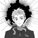
happy new year! aside from sketching more comic pages my first art of the year is a revisit of the design for Wyvern's first cover. i am currently tossing up between thumbnail 2 and 2a, what do you think?
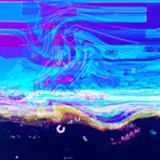
i have stuck with the black hole image and really tried to push the concept to be as in your face as possible. i think it was something Tim Sale said in his artbook about cover design that stuck in my head, at the end of the day the best kind of cover is one that is able to stand out on a shelf surrounded with other books.
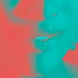
its also fun to revisit the gravitational lensing effect and seeing where i can take it. the figure i used as reference comes from this paper (http://dx.doi.org/10.1088/0264-9381/32/6/065001) which i am not smart enough to read but it was still helpful
W.D. Taylor
2023-01-08 22:49:02 +0000 UTCRook
2023-01-08 12:47:03 +0000 UTCsylviedotcat
2023-01-08 08:29:19 +0000 UTC