Bonus 2018-12-07: Custom tablet, technique and storyboarding approach
Added 2018-12-07 17:20:18 +0000 UTC(if you can't see the pictures in your email client, check the article on Patreon website, thanks!)
Hi Patrons! since my last "weekly news" on Capitole du Libre, I focused a lot of my time on the blog of Pepper&Carrot and social medias; so you probably have all the updates if you follow the project. If not, check the Five latest blog posts since the 20 november (in short: new book cover illustration, a Code of Conduct, 100 fan-arts! ).
Here are the topics I have in background (they'll be transformed later in article for sure).
A custom tablet
For the previous episode 27, I tried to do it fully with the Cintiq13HD (a pen display). I know well this device and that sort of worked but in the end I wasn't happy with the experience and still frustrated by many aspect (low screen size, low candela/m², hard to calibrate color and coordinate, more bugs using it). So I decided to find an alternative at home and tweak the Intuos4 XL I bought last year. After removing the coating, putting a plank of thin wood on the half top for the keyboard and adding a Huion surface on the bottom part (Huio sells large surface for the WH1409) ; I could tweak a custom 16:9 XXL classic tablet. Something larger and better than any Huion or IntuosPro on the market. What a comfort! I have been very productive with it so far, sketching all day, illustrating all article I post. This rigg really invites me to draw more. Here under is a photo of my desk while finishing third book cover.
If the production of episode 28 is a success with it, I'll do a detailed article about this tablet and how with GNU/Linux and xsetwacom I can map a 16:9 on the large active surface. I'm really happy to have found *my* tablet and to think about it; it is really near experience of my old Intuos3 large when I worked with monitor 1024x768px. The monitor grew a lot on size since the last decade, but the tablet shrank... There is absolutely no logic to that! With this customization I'm just rebuilding the ratio I had during almost ten years, but this time between a 16:9 21.5inch 1080p monitor and a 16:9 active surface tablet. Finally, things feels right for me.

A custom technique
During episode 27, I put myself the challenge of producing the episode in October only (that was impossible, I'll do an article public about that later.) With the pressure, I panicked and went in all the possible traps. The episode finished with a series of sleep-less night to try to correct all the mistake and it was a total mess for my health and life. I like the result, it was a challenge, but I even don't want to make a making-of about it...
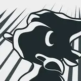
That experience was a good lesson and motivated me this time to start again more experiments about the way I'm painting and drawing on Krita. With the help of the tiny KDE app Kronometer --I used the "Lap" feature to measure the time I spent on each step of the drawing-- I measured many (many!) speedpaintings and test. One of them: fan-art of Secret of Mana (picture under) was the first one that passed all the steps. My (too) early step-by-step is a bit counter-intuitive, but I'll try here to detail what steps I found:
1. Drawing, must be done thick (ideal is 2x thicker the wanted line at the end), with a textured brush, half transparent (like if made of ink with a lot of water). A reddish dark ink works often. The drawing can be done very quickly without any details. But no sketchy lines, pure lines, easier to cleanup. No crosshatched shading, or area filled. Just outlining the main shapes as for low-polygon video game characters or background. If design are poor or too simple, not a problem: real drawing will come later. What is important is: composition, proportions and perspective. All of that must be solid and almost final.
2. Color wash: fill the canvas with a single color that will be the ambiant overall color. Build up the palette against this main color with airbrushes. It will create a lot of in-betweens, no edge or texture to be distracted. It is the ideal step to focus on the color as a device to bring emotion, aesthetic and think about the shading. Shading with a three point lighting rigg is necessary at the core. The palette will tend to be a bit dull, and not enough constrated and saturated at this point but this effect is desired as it is simple to build contrast, saturation later with strokes over this color; the stroke will only be more visible this way.
--- At this step: the artwork (picture under, left part) has all information to communicate all the intent: shape, color, message/meaning in a record time. This workflow is an efficient way to get a colored rough and propose something in a collaborative environment. This is something that was a necessity on my criteria.
3. Texturing: I love when an artwork contains large strokes of painting, texture of chalk, watercolor colors pigment visible in stain of water... I'm adding happy accidents and organic life to the piece: the clothes, the bark of a tree; many things can be suggested with large stroke of painting and Krita has a rich set of textured brushes.
4. Building edges and cleaning. With a mid sized brush, I work all the shape to feel solid and easy to read: eg, the fold of the shirt, the hair. Because the palette is a bit dull, it is easy to introduce dramatic edges and pick a shading color or light color over the cloudy sketch. At this step most of the original drawing line-art disapear, lines melt under the painting. I feels like gouache thick stroke over a textured thin watercolor layer. This "thick on thin" aspect is appealing to me.
5. Detailing. For detailing, I zoom in and use a brushsize the same than the one I used for the drawing , but divided by two. I really start to draw at this step. I finish the part of the picture, I reintroduce sometime lines where they feel necessary and I try to not clean all too much. You can't invent spontaneity in painting; but with a set of wise step you can preserve it. It is important to keep the texture of larger stroke done before and keep the feeling a "human hand" did that. Detailing or fixing an area too much destroy a piece. It feels like a too heavy paint over.
That's all. the main traps are: don't draw too well even if getting a good drawing in the first step feels very securing (counter-intuitive), don't build edges while color sketching, it will look smooth, edge less but this will help at creating a palette in a good time (counter-intuitive too) ... This steps helps to prototype an artwork quickly, and let a lot of room to finish/texture/detail the artwork in a single pass. No patched workaround on the top, only the stroke added were added, nothing to remove. It is really economic and Kronometer measured very good time with it. Also, detailing being like drawing on the top is a very creative a funny time of the painting (adding details, enhancing, building on the top) and not a boring cleaning pass, or paint-over to fix issues.
Here is a gallery of pictures:

^ the speedpainting test that succeed

^ Some of the failed test I posted anyway. They received all heavy make up on the top, so they are ok, but they took a lot more time than necessary(Main time lost: too much time spent on getting a good detailed drawing and then boring filling the gap/area workflow.).

^ Some test I made to redo the illustrations of the "Contribute" page on the website. I still like to draw detailed artwork; but when the drawing is the finality I think.

^ Episode 7, the wish. A couple of panel were done with a similar technique that I'm rediscovering now and standardizing. But it wasn't done on purpose.

^ Same for episode 9, the Birthday Party.
A new way approach storyboard
So far, I was doing the storyboard this way (picture under). I'm not showing ep28 in it (to not spoil) this a screenshot comes from ep23:

In this method I put the page side by side on Krita, and draw the story this way. Two line of three or four pages. On episode 28, I made two board like that. ( I detail why in last weekly post). Then I cut each page in Krita, past them on their own Krita file, and port manually (retype) the text on Inkscape were I also vectorise all the speechbubble. I create the first prototype english lang folder this way and I feed the renderfarm. I'm launching the renderfarm and then only I can read the comic in Firefox after adding a blog post in localhost. There is a huge gap between the file I'm working on, and the result. So when I read the first version on Firefox after all this work I rarely get a "Tadaaaa!" effect... I'm scrolling and... the episode is cool, but doesn't work! the speechbubble placement feels not logic, the panel appears on monitor very weird... Some face of character feels to big. Some panels feels too compressed... There is a big difference between discovering a comic page "full" in real life like after turning a page in a book and scrolling partially into it. My system of thumbnail and storyboard is just not adapted....

(^ a page from old storyboard of episode 28; the three panel on the bottom with the text placement on the top and artwork on bottom required the user to scroll up and down to read the sequence... three time, like doing a wave gesture to read the text on top, then scroll to the bottom... Plus, during scrolling, it looks like a wall of text... not inviting!... epic fail. But with the low flexibility of this workflow and disconnection of the webcomic format plus the constrain of the translation system, not really a surprise).
Fortunately, I found a solution while watching a documentary about my favorite manga artist: he drew his storyboard on a little sketchbook, almost the same size of his final printed manga. And I thought he had a good point to design the user experience first, because this way he could control the communication between reader and the object: the size of heads during discussions between characters, the size of a panel to focus on the emotion; when to put a full landscape in double page... The format brings a lot of things for the experience. It was so obvious! ... and I remember I started Pepper&Carrot this way. Without a translation system, without cutting things in page for the derivative printed version; I just designed a long long strip in Krita.
So, I re-centered myself on the idea Pepper&Carrot is at first a webcomic, and the original approach was the best. A digital webcomic is made to be scrolled (desktop/smarphone/tablet). Vertical scrolling is king, and I want to design the experience around that.
In order to do so; I built a template in Krita [file in attachement] that look exactly like the website when the episode is posted. This gives me a fully WYSIWG experience and I paint my webcomic directly on this canvas and I can replay the scrolling experience with the canvas on Krita in real time. Because the document is huge; I scaled it to half size. I'll paint in it just the line-art+color-wash part of the workflow. I have grids to know when the physical page are cut so it will be easy to split it once the prototype will work. My artwork will not suffer when I'll upscale them to 200% later and split the pages into many files and translation SVG files.

^ painting pages on Krita looks like that; at 67% of the viewport (a discrete size easy to reach with + and - on keyboard) I have the exact same rendering I would have on the website.

^ Getting an immediate feedback gave me many new ideas: a new shot, a camera diving in the scene while the reader scroll to emulate a camera movement. I used Blender 2.8 to work on perspective and find a view angles.

The simple drawings and color wash rendering (the first milestone of the painting technique I'm applying now) helps me at focusing on the ambiance of the scenes. I love it because this workflow, this approach and the tablet all are working well together.
This week I'm still working on the storyboard of the episode 28 done this way ; I started to convert my previous storyboard to this new approach.
End notes
During the last weeks, I worked to enhance a lot of things around me. It was really necessary. You could read here what I have done about my tablet, painting technique and storyboard. It's promising, but might also fail during the production. That's why I'm not posting things about that yet to the public. I also worked on the website of Pepper&Carrot, my backup system, my daily routine (diet, sport, health, sleep hours) and took more time to simply enjoy life. I was lucky to fund this period of November thanks to freelance work I did but also thanks to your patronage for the previous episode 27. I'll focus December to work only on episode 28 but with the holidays, it might be hard to get the episode done. I'll see if my new technique and approach is really valid :)
Many thanks for reading my long article, I hope you liked it! I'm around if you have any question, observation or if you simply want to share a little comment. Have a good week-end!
Comments
Thank you. I wasn't planning to buy the Huion surfaces due to how long I have to wait but I guess I'll buy some since it's on sale now. Also have you used other nibs from Wacom? Such as the stroke nibs, hard felt nibs, flex nibs?
Yabo 'Yalyn' Vinkindo
2018-12-11 06:27:40 +0000 UTCHey! This sheet are the same type than Intuos3 overlays. Smooth, but with a very subtle 'pshhhhhh' when browsing with the finger on the surface. It's a mix with low friction but at the same time enough to help to mentally track where the stylus here. I also flatten a bit a plastic tip of the stylus to create a little bit more contact with the surface, it help at getting that perfect grip (I mean, just the Intuos3 grip I was used to paint during 15years. All is relative). I found them here: <a href="https://www.huiontablet.com/all-products/accessories/surface.html" rel="nofollow noopener" target="_blank">https://www.huiontablet.com/all-products/accessories/surface.html</a> (pretty hidden) and the WH1409 is 38x25cm. I'll look at Dura-Lar film, I don't know them.
David Revoy
2018-12-08 10:00:15 +0000 UTCThank you for sharing your process in this depth, this is really interesting.
Bernhard
2018-12-08 01:25:17 +0000 UTCOh! Quick questions. How is that Huion sheet surface compared to Intuos3? Is it smooth but not ultra-smooth that you have control of your paint strokes? Does it produce scratchy sounds? I bought a used Intuos3 and it had one deep scratch on it. Was thinking of buying Huion sheet but I also was thinking of getting Dura-Lar Film sheet too.
Yabo 'Yalyn' Vinkindo
2018-12-07 21:51:38 +0000 UTC