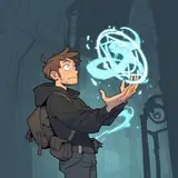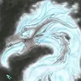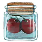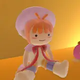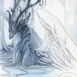
Every year in December I will do some free doodles for Christmas, either on Twitter or FA. (By the way, if any of you want one drop me a ref and I'll put them at the front of the line)
I'm trying to figure out where I go wrong with design. SOMETHING is amiss but I'm having such a hard time figuring out what it is???
First of all, I am NO GOOD with fat lines. I'm not sure if my natural style doesn't mesh well or if the fat lines simply reveal my short-comings in design.
Secondly, everything looks extremely flat. Well, that's often the case with flat color. If I were to shade it might come out better? But then again, maybe not? Something is amiss there, as well. I don't do enough ... sculpting. Even with the flat color and line. I don't do enough layering of shapes. But when I try to do this it looks messy and overwrought????
The lines are TOO SMOOTH. I don't mean untextured, I mean uninformed. There's not enough specificity in there but at the same time there's too much drawing from real life, which results in something kind of unappealing.
Also the best way to make something 'realistic', even if it's stylized, is to use reference, but I feel like reference slows down and interrupts my flow. No idea what to do about this.
Art is hard, my peeps. It's hard and exhausting. D8
hibbary
2021-12-13 19:02:19 +0000 UTCRhee
2021-12-13 18:37:42 +0000 UTChibbary
2021-12-13 18:26:29 +0000 UTCRhee
2021-12-13 18:22:52 +0000 UTC