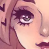
For a while now, I've been doing my best to keep my saturation under control, and to make my colors way more pastel-ish because (and I do believe this), it does look better overall. Over-saturating is kind of a cheap trick to make something eye-grabbing, but it also becomes garish and sickening. I think that's me though. I think I'm garish and sickening. I think I'm just going to embrace messy saturated colors that hurt the eyes.
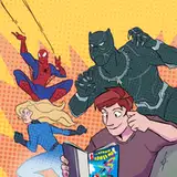
I'm very excited to do the second half for this. This 2-panel comic is going to have a fun punch-line.
That black guy
2019-06-08 14:13:52 +0000 UTCAce
2019-06-08 12:26:03 +0000 UTCKrash & Fabs
2019-06-08 11:15:44 +0000 UTC