XaiJu
mcahogarth
mcahogarth

patreon


Testing Book Covers

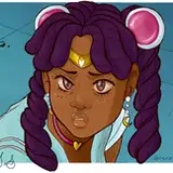
It's been an exciting few days! But we're drying off, so it's back to work. One of my long term backburner quests is to recover my books so they more accurately signal their science-fictionness, so I took a stab at it with Dragons' Fealty. Do you think this cover reflects the genre/story type better?

Testing Book Covers Testing Book Covers

Comments

Not really. Low contrast and colors are off-putting. Can't decipher the title words. Good start but unfinished looking

Melody Peters

Yes, stars and nebulas help sell the sci-fi angle. The juxtaposition with your lovely watercolor illustration might cause confusion since it's not what you expect to see on a sci-fi book (calla lilies IN SPAAAAAACE). I also agree a textured background can make reading the text more difficult in places - maybe do a solid background behind the text and tweak the background on the spine to remove the dark patch?

Liz

I concur that the stars are nice, but make it hard to read/parse the words. It also feels busy?

Mairead McLoughlin


More Creators