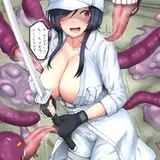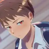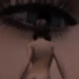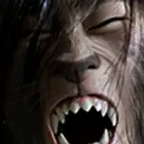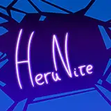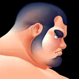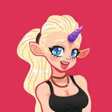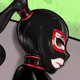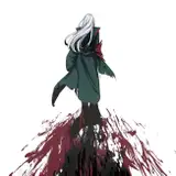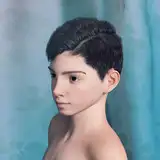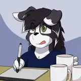
We've gotten some nice feedback on the new thumbnail design scheme on ComicPop Returns. We're also seeing the same scheme being used a lot more on OTHER peoples' channels, now. My question is-- do you like them with no words, or some indication of what's happening? We have our new scheme applied to Off the Rack with the huge lettering over it, but we're not doing that elsewhere. Would you like that, or prefer to leave it kind of vague? Got a couple of examples for an upcoming video here for you to check out!
Bear Farmer
2024-10-31 05:03:52 +0000 UTCChristopher Wolf
2024-10-31 00:39:08 +0000 UTCJason Heddleson
2024-10-30 21:17:47 +0000 UTCTayler Gallagher
2024-10-30 19:00:56 +0000 UTCAustin
2024-10-30 17:40:04 +0000 UTCM JLoon
2024-10-30 17:26:55 +0000 UTCIan Cameron
2024-10-30 17:02:54 +0000 UTCJ Mortensen
2024-10-30 17:01:42 +0000 UTCKyle Schrader
2024-10-30 16:53:22 +0000 UTCMatt Hernandez
2024-10-30 16:49:10 +0000 UTCPlutotheOverseer
2024-10-30 16:49:05 +0000 UTCLex Larsen
2024-10-30 16:47:50 +0000 UTC