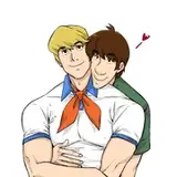
The solicitation for BILL AND TED ARE DOOMED #3 is pretty imminent, so here's an exclusive preview for you folks of the cover Sarah and I did for it.
THE ROUGH (click the second image up there to see it): As with the first two covers, I pitched the cover idea with an index card scribble to keep things simple and avoid unnecessary noodling. I have the tendency to overwork roughs, but in the last few years I finally figured out that editors and publishers hire me knowing what my artwork looks like. The rough is an idea, a sketched elevator pitch for the finished version. My overcompensating by drawing a super tight rough was often time wasted -- if it's rejected you wasted time on it. And drawing it too tightly might also lock you into elements or forms you could be better off not sticking to. If it's tight it's not always right. Of course, if you're a brilliant, fast artist, then by all means, have at thee. I'm neither.
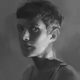
PENCILS: As opposed to roughs, I still pencil pretty tightly. I'm not (and never will be) facile enough as an inker to improvise on the page much, it gets me into a lot of trouble if I don't lay that map down for the most part. You can see I abandoned some elements from the index card rough -- I didn't have time to work out an elaborate headpiece for the main villain, and decided it wasn't necessarily the best way to go -- we want to see the guy's face here. He's our main villain, and he really doesn't go in for that look in the scripts as it turned out. And I also didn't want to lock Roger Langridge into some intricate designs for the interior art. As it was, I told him he didn't have to adhere to the band members as I designed them for our cover, but he did end up using them, although obviously revised in his style.
You can see in the scan I made of the pencils that I hadn't done the reference work yet for the mountains. That's exactly the kind of detail/texturing I'm not good at setting down without pencils, and without looking at some photos online and some takes by other artists to get a better feel for working it out. I'm not super at backgrounds, I ache outdoorsy stuff especially. Reference is your friend, even if it sometimes feels like an enemy when you don't quite "get" it. Backgrounds and nature are two things I wish I had studied as a young cartoonist. And anatomy. And perspective. You get there to some degree, sort of.
INKS: I am not happy with the way I inked Bill and Ted's faces, I just lost something that was nicer-looking in the pencils and it really bugs me. Bill's facial features and Ted's hair, especially. I did okay with the figure and clothing, although my fold theories are always more like fold quackery, even when I work with reference. I don't "see" fabric well at all, coupled with actual anatomy lapses and you get some chicanery on the page. But it looks like cartooning, and it looks pretty attractive, so, there's that to compensate.
The evil metal band members came off best, probably because I didn't tense up with approximating likenesses (we don't have licenses to use actor's actual likenesses, which is a relief, because that would take me many more hours to still not come close to even caricature-accuracy). I did okay on the mountains if not great, it will be covered by the logo for the most part, so, I probably spent a lot more time there than I should have, anyway. I assume I tightened up the visible band equipment and guitars before inking, because I wouldn't have been able to improvise that in the inking stage at all.
COLORS: I have no idea! Sarah colored it. It's computer magic, a complete mystery to one such as I who can barely use color pencils.
OVERALL: I think it came out really nicely, all together. If time wasn't an issue, I would have gone in and done a patch for Bill's head. I'm like that. But it does what I wanted it to do, and hopefully works with the logo and text and all that okay.
Folks who read the story we did for HELLBOY: WEIRD TALES a while back will notice I dipped back into the world of black/death metal for this series. I'm not a huge fan, but the genres have their moments, and they provided some fun, over-the-top villains for Bill and Ted to deal with. Visually, they're more interesting than your average musicians. Anyway, there you go. Evil Metal vs Wyld Stallyns. Among other things. It gets stupider in issue #4, which, hopefully, is a good thing.
I'm going to go get something to eat. I've been up a while and haven't eaten anything, not even my anxiety medicine (oops). PRO TIP: Eat something. And take your meds.