Howdy, Traxians!
Your oldest Internet Pal Erik here, coming to you LIVE on this fittingly gloomy winter day from Portland, Oregon, and I'm here to bring you a little post with some inside baseball on a topic I always love to discuss: design! This time, said baseball relates to our latest feature-length special of shorts, GrimTrax, and the take on our Riff Planet logo that we created for the occasion.
[Click here for a post from 2019 where I detail how the Riff Planet logo came to be.]
We started with an all-hands-on-deck brainstorming session wherein every aspect was discussed. The name "GrimTrax" had already been solidified a while back, and as the date of release grew closer, Kevin thought it would be fun to redo our musical stinger with a version that's slowed down and in a minor key, as it would really change the entire tone. In addition, we felt it would be beneficial to create a new logo to go with that, all in an effort to really help differentiate this as a standalone entry in the catalog. Nik saw an image in his head where everything about the new Riff Planet was the opposite of the existing one:
"I imagined a sort of Brutalist, Bizarro World version where the planet was a cube of concrete with water stains and [the font] LaffRiot was replaced with a block Cyrillic-looking logotype."
I personally enjoy the fact that Bill picked up on the Bizarro World comic inspiration during the recent Hangin' Out livestream. I posted the cover that Nik had in mind as the header image for this post - we went with that as our main reference.
The process of creating that GrimTrax logo turned into a fun collaboration between several RiffTrax colleagues in our workplace chat: our web engineer Nik Anderson, video editors Casey June and Tony Masiello, technical director David Martin, graphic designer Jason Martin, and me.
We're very lucky to have Jason as our resident graphic artist, because within a short while, we were already giving feedback on a proof of concept. Here he is along with Nik and myself discussing the first stab at it:

My idea of inverted, frowny-face planetary rings ended up not working after all, but that shows we were trying to really think of every way we could possibly reinvent the logo in order to differentiate GrimTrax as something new and outside of our usual offerings.
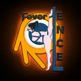
We briefly tested some A.I. image generators to produce a "microphone made of concrete" but the results ended up being pretty subpar. Shocking, I know. So Jason took the original spherical mic into Photoshop and used the Liquify tool to reshape it into something of a cuboid, and that gave us the best version yet:

Now we're talkin' GrimTrax! This one we all agreed was really good, but still too cheery. Besides the colors being too bright, to me the font was a little bit "Monsters Inc." In other words: not depressing enough! We talked through some other font options, possibly annoying Jason in the process:

The one we all agreed worked the best was just plain enough to be readable, while still helping to suggest the idea of "grimness":

And thus, the GrimTrax logo was born! My favorite part of the entire thing has to be how perfectly it combines with Kevin's minor-key musical "sting" — complete with Norman Krasner-esque wailing and groaning that goes on a little too long.
So there you have it! We enjoyed going through this exercise, because all of these things coming together ended up meshing surprisingly well. As a small team that's been doing this for many years now, we all have the freedom - and are encouraged - to chime in with these kinds of creative ideas, and I think the final result is all the better for it.
Despite its subject matter, the writers really surprised me, and delivered a very funny feature-length riff full of gallows humor. It has, at least for me, actually helped with the seasonal gloom. It's almost cathartic in a way, mining humor out of dark subjects. And once you've seen GrimTrax, everything else seems a lot brighter - even if the planet is made of concrete.
Until next time!
Your pal,
Erik
Andrew Bosch
2024-01-30 03:58:07 +0000 UTCJustin Comer
2024-01-23 19:04:19 +0000 UTCRiffTrax
2024-01-21 20:44:32 +0000 UTCSuzi Eberhard
2024-01-20 23:42:49 +0000 UTCrockandrollsteve
2024-01-20 22:56:22 +0000 UTCAriel Freeman
2024-01-20 22:13:20 +0000 UTCRiffTrax
2024-01-20 22:03:42 +0000 UTCRiffTrax
2024-01-20 22:03:33 +0000 UTCEmily Brown
2024-01-20 22:00:44 +0000 UTCKarl Hamann
2024-01-20 21:59:47 +0000 UTC