A technical blog...
Added 2024-02-25 21:48:32 +0000 UTCI've been hard at work the past few weeks to set up a bunch of new environments for chapter 8, as well as creating some new characters, and dusting off some old ones.
When working on sets, outfits, and situations, I always try to pay a lot of attention to personalizing it to the characters it is for. Whether it's a bedroom, kitchen, or an office, people leave their marks on the spaces they inhabit, and in fleshing out those spaces , I get to learn a little bit more about the character as well, so it's a two-way street.
In this case, the situation called for mug, and I got to thinking, what kind of coffee mug would a slightly nerdy person use, one that's already confessed having been into roleplaying (the version with the dice) at some point in their live? So I took this existing mug asset that had a decal on it and a slightly worn look...

...and I decided to do a little design of my own.

As you can see it's not bad, but it's got a ghost of that old decal on it. It turns out, that's the effect of a normal map on the original cup that I didn't clear out. It's actually kinda neat, right?
Let's see if we can't get something like that going too for our design. But before we do, let's live up to the promise of a technical blogpost, and dive a little deeper into the different kinds of texture maps you can apply to an object for the purpose of adding details.
Although I've used all these techniques, I haven't actually dug all that deep into the differences between them, so it's a nice opportunity to learn something for, well, hopefully both of us, but at the very least for me.
1. Bump maps
Almost anyone that's ever looked at textures on 3d models, will be aware of a thing called a "bump map". And even if you haven't, it's not hard to figure out what it does, right?
Just like a color texture map applies colors to the 3d model, a bump map applies bumps. It's a very simple and powerful tool to add a "texture" or feeling to a surface, and apply some fine details. Like adding the weave of a fabric, or pores on skin, or the grain of wood.
The way it does this is by shading or lighting up parts of the surface, to simulate indentations being in the shadow, and ridges catching a little more light. Note that it doesn't actually add ridges and indentations to our object, the surface is still round and smooth. It's just painting on shadows and lighter areas, depending on where the light sources are.
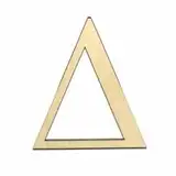
But like I said, it's a great and relatively cheap way to add some sort of feel to a surface with little effort. So let's keep it simple, and just take our logo image and convert it into grey scale.

When we apply that, you can see that already does a decent job.

It's most noticeable on the neck and the left shoulder of the wyvern, where a gleam is added, but if you zoom in, you can also see detailing around the letters and the black outlining of the figure. The light bits in the black-and-white bump map we provided are now look slightly elevated, and the darker bits on the map look indented.
Inverting the image also inverts the ridges and indentations as you'd expect...

...most noticeable with the black outline around the neck, unless you zoom in.
Note that if you look closely at where the letters curve away from us, like on the last S of the word 'monsters', the illusion breaks. The bump effect is painted on top of the figure, but it's actual shape is unchanged, and you can notice there's no bits sticking out when looking at it from the side.
2. Displacement maps
There's a second type of map you can use to give an object more texture. It's called a "displacement map".
It's quite similar to a bump map, with one big exception. It doesn't merely paint some shadows and bright spots on a smooth surface, it actually adds ridges and indentations to the geometry of the surface. It's adding additional polygons to the object.
Polygons in this case are simple flat bits, usually triangles, that are stuck together at the edges by the thousands (or sometimes millions) to make up the geometry (shape) of a complex object, like a cup, or a person. But there's a downside to using it.
For one, it is expensive. It basically takes the existing geometry of the object, and, depending on what you set up when you applied it, it multiplies the polygons of that object it by a factor of two, four, eight, or more times. That's a lot of extra polygons that need to be stored in memory, and to be processed during rendering, and that can be a problem if the object is already quite complex and high on polygons.
It also doesn't work all that nice when the object is very simple to begin with, and doesn't have a lot of polygons, because even when multiplying its polygons a few times, some parts will still be low on polygons and the displacement map won't be adding much fine detail, just coarse bumps.
Plugging in the same map we used for the bump map earlier, you can see just that happening.

There's a lot more going on that with the bump map, especially when you look at the upturned wing, and around the tip of the tail. It looks messy and rough though.
However, you can see by the last letters in the word 'monsters' that it's actually sticking out of the object, and hiding some of the inking of the letters. It's not just painted on, it's changing the surface.
But it's also clear from this experiment that displacement maps just don't do fine detail well. In this case, I'd already doubled the object polygons twice, and I could probably do that once or twice more without much trouble, but it's a lot of memory being taken up by a pretty simple object.
So you can use displacement maps for larger features on a surface, and the fact that it's adding geometry, casting shadows, and occluding stuff from vision is nice, but bump maps are much better for adding fine detail, which is what we need in this case.
3. Normal maps
But to get back to how we started this, the ghost shape of the original lettering we saw at the start wasn't left by a bump map or a displacement map, but by a stray normal map. So that's a third way for adding details to a surface.
If you look at a little detail of that normal map, things look... weird.

It's blueish and red and green, and it kinda looks like there's a 3d shape for that image in there, but how would we even go about making that ourselves? It's not just an image that's mapping out the height, it's something else.
So what is it? Because clearly, the word normal is not intended to mean usual, or typical.
If you had some geometry at school, you might remember a thing called normal vectors: vectors that stand out from a plane (aka surface) at a right angle. Basically, it's an arrow pointing in the direct the surface is, er, facing.
So, is that map telling the render engine that bits of the surface aren't facing the same direction as the rest of it, but somewhere else? That's basically what ridges and indentations do, right? They slope upwards or downwards, and face a different way when they do. So maybe, unlike a bump map, this map isn't telling the render engine where it needs to add shadows and highlight based on height, but instead it's telling the render engine to reflect the light at a different angle when it hits a particular spot, based on where it's facing?
That's great and all, but how can we try and make one, so we can just see what it does? Well, it turns out that Gimp, a fantastically feature-rich, free to use graphics editor, happens to ship with a filter that can make one for you (filters->generic->normal map).
So let's make one using our bump map as a base...

...and apply it.

Cool. You can see here too it's doing a lot more catching and reflect light than that bump map, like around the upturned wing and the tip of the tail. But without the roughness of the displacement map. And while the illusion still breaks around the letters curving away from us, the effect is a little less pronounced. It is a little bit rougher than the bump map though.
In hindsight, that's probably because the resolution for the image I used to create the normal map is a bit low. Still, it's looking pretty good for all of what turned out to be two minutes of actual work, so I think I'll stick with that, seeing how this mug will not be viewed up close anyway.
So now the last thing to do is put this well-worn mug into the habitat of its owner, and wrap up this post with that sneak peek I promised, which is one post below this one for the appropriate tiers.
(note, usually I don't go that deep into creating a prop unless it's quite significant to the story, but in this case I figured it'd be a nice case to use for learning a bit more about textures, and sharing what I learned with you)
Comments
Cheers, you're welcome. I was a little worried it might be too technical, but I'm glad you and many others enjoyed it!
Naughty Road
2024-02-27 18:53:13 +0000 UTCThe mug may not be viewed close up but, after this post, we'll all be looking out for it! Many thanks for the insight.
Nic
2024-02-27 17:43:00 +0000 UTCGlad you enjoyed it. It's one of those subjects with endless complexity too, where ever you decide to dig in. This bit is all about shapes, but there's a ton of stuff to say about reflection and refraction, top coats, specular effects, glossy effects, translucency, sub surface scattering, it just goes on and on, and a lot of it is still very arcane to me. :D
Naughty Road
2024-02-26 17:30:44 +0000 UTCThis is fascinating, I've been idly curious about this sort of thing since my college roommate spent a day rendering a chrome teapot on his 90Mhz(!) Pentium sometime late last century. I appreciate it when designers go above and beyond the call of duty.
Troy B.
2024-02-26 16:34:47 +0000 UTC