
BATS IN THE RING has been a project a few years in the making. Back in 2017, I jotted down in a notepad "batfamily as wrestlers!" and knew it was an idea I'd love to bring to life, but I knew I didn't have the skill to execute it. My environments were bad, my painting was subpar, and anatomy - phew. So I shelved it away as a dream project, something to be accomplished "later" when I was "better" at art.
Fast forward to this past fall, and my feelings towards my own art were swinging from extreme highs to extreme lows. I spent so much of 2019 really working to actively improve at art, and I learned so much, but that didn't change how frustrated I felt that I still don't have confidence in my work, or the disappointment that consumed me when I drew something I thought would fare well in social media but didn't.
At my lowest, my friend encouraged me to just draw something fun. So I thought about it: what would be fun? What could I draw that would make me happy, if no one else?
And then I remembered about wrestling. Did I think I was good enough to accomplish it yet? Honestly, no, but I decided to hell with it. There's no time like the present? I asked my sister, a wrestling buff, for moves the batfamily characters I wanted to include in the series could use, and she delivered both the moves and enthusiasm for my idea. A little bit of research (and honestly, watching wrestling matches on YouTube is my kind of research!!), a LOT of thumbnailing and colorscripting later, and I was ready to go with the first act of Bats in the Ring.
You've probably seen some of the Bats in the Ring pieces by now, but there's SO much that went into them that I don't get a chance to talk about on Twitter or Instagram, so here we go! A deep dive into the process, approach, and every single pun/play on words and reference in BATS IN THE RING.

I've never done a multi-image project before, but I knew some things going into Bats in the Ring: I wanted it to be sequential and follow a storyline, like a real wrestling match, and I knew each image would be released on social media one at a time, so each illustration needed to tell a full story on its own. To keep things cohesive, I wanted the color palettes of the individual illustrations to flow somehow, so the first thing I did after thumbnailing the compositions was to sit down and make a colorscript. Some of the colors eventually changed, but I tried to set up a flow of yellow to blue, back to yellow.
I'll delve into the color of each illustration in detail later, but for now I just want to point out the lil smiles I gave thumbnail Dick Grayson. Truly, I am a talented draftsman. (I am not.)

I needed to start the series off with a bang, so I went with a high angle, immersive shot for Jason's wrestling entrance. (By the way, I love the theatrics of wrestling entrances. It's so incredibly extra, JUST LIKE ME)
I also needed to convey to the audience with Jason's pose and body language that he is the heel. Wrestlers are generally divided into two archtypes, the heels and the faces (good guys). GENERALLY, the audience cheers for the faces, and boos/heckles the heels. For anyone who isn't a wrestling fan, Jason's pose just needed to read as grand and theatrical.
My favorite part about doing a wrestling project is how much of the background I can make light up. You folks know I'm allll about ridiculous lighting. How much more ridiculous is a massive LED screen behind the character paired with an LED walkway?!
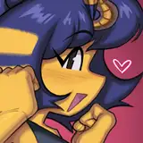
I'll also take this opportunity to discuss Jason's wrestling outfit: it's more or less his old comic costume, but I switched his combat boots for tall wrestling boots. I also knew his leather jacket would just be a part of his entrance gear, and would get discarded en route or once in the ring, leaving him in just a shirt and cargo-esque pants. Honestly, Jason's comic outfit didn't need much tweaking to wrestling-fy.
This piece was kind of a nightmare, but made much, much easier because of a SketchFab artist named vinnyhaw, who let me use their 3D model of a WWE arena as a reference and for paintovers.

Here's what part 2 looked like in the early stages. I always begin my sketching the perspective and composition I want before I grab screenshots of vinnyhaw's model to fine tune my perspective. This was my original plan for the colors, too: I wanted the suggestion that Jason was still bathed in the yellow light from the prior image, and was approaching the ring which was lit up in blue lights.
I also thought I'd show him discarding the jacket in this shot, but ultimately scrapped that idea, because having the jacket mid-fall or as a lump on the ground was super distracting and unnecessary from a composition standpoint.
You can also see HOW MUCH of the arena I needed to map out in perspective for this ultra low angle shot, knowing that I'd eventually crop it down to a 16:9 view (like a movie!).

Beginning to render the ring and Jason. I was reallyyyy trying to make the yellow/blue lighting work, but I just wasn't feeling it. I switched to the red because the contrast was more visually interesting, and it still sort of works - in the final, he's lit by the red LED of the "Red Hood" text, rather than the yellow of the LED walkway!

Finally, it seems obvious now that we're well into the match, but I was trying to have some air of mystery over who his opponent was going to be. I mean, just a little mystery. The blue lighting and the spotlights in the shape of a V were my dead giveaway that he was heading towards Nightwing!
Oh lord. Brace yourselves. This piece went through.... a process. I thought because the focus would be on Dick and I didn't have much environment to render, it'd be easy but I thought wrong.

I refined the full-body pose from the colorscript thumbnail, but quickly confronted my inability to draw legs. I tried for so long to make that full-body pose work before scrapping the lower half of his body and making it a waist-up shot. (Can't mess up legs if you don't show them!!! That's what I always say!!) As a bonus, the tighter crop does give the viewer a break from the rest of the series, which is mostly full-body shots.
Okay, no, really, please brace yourselves, the following image cannot be unseen:

I painted at least THREE different versions of Dick's face before landing on the final one. The one on the left is the least offensive of the three failed attempts, and it's STILL a nightmare. I got wayyy too hung up on trying to emphasize the upshot angle by showing the planes beneath his chin, the lower planes of his nose, his mouth, etc... My focus on trying to do a human face in upshot perspective sacrificed everything: Dick's likeness, personality, and most of all just... being... not hideous to look at?!
On my fourth time scrapping the entire thing to repaint it, I went back to trying to capture the charm that came through of his face from the original sketch. I made the upshot angle less intense, and finally got to something that looked okay, although there was something that still deeply unsettled me about the attempt on the right. I came so close to scrapping this entire painting and starting over with a completely different shot, but I'm so glad I didn't because I love how his face turned out in the end!

Turns out - if you were wondering - what was unsettling to me was his TEETH. I shortened them, and suddenly I went from uncanny valley to Dick Grayson!
I wanted him to look fresh and charming, to really capture the essence of the word "babyface" (which is what the wrestling term face is short for! Double entendres are fun!). I used the clean, white lighting to help emphasize that feeling of freshness. I needed it to be unmistakable that Dick is the hero contrasted to Jason's antagonist. Oh - and it also needed to be clear from the title and the belt that Dick is currently the reigning champion.
This was by far my favorite piece of the series, both to work on and to look at!

Since a lot of wrestling matches are shot by cameramen standing on the floor below the ring level, doing dramatic, low angle shots was something I was super excited to do with this project.
I don't have much to say about the process - it all went really straightforward. Sketched my initial concept for the composition, fine tuned the perspective with Perspective Tools, rendered the boys in a different, larger resolution file (so that I could use my big brushes!), then placed them back in the main file so I could begin working on the background.
Having this same shot be reflected in the giant screen was something I'd been hoping would work out, but I had no idea if it would. My biggest worry was that the corner of the screen would be visible and I'd have to do an endless repeating mirror effect (ugh), but! It all worked out just fine in the end!

Some details in the background:
1) DCW is the name I've given my fake DC wrestling promotion. The Japanese in the same banner is my name. Haha! (I gotta try to fight reposters somehow, you know??)
2) The audience sign was actually taken from a piece of Bats in the Ring fanart a Twitter user made! LOOK AT IT. I LOVE IT SO MUCH

3) The green lighting is meant to symbolize Jason and Dick meeting for the first time in the same shot, by mixing their lighting from previous images in the series (yellow and blue, respectively) together! Plus I think I'm just entering a green phase. (My years-long purple phase is coming to an end!)
Finally - the title of this piece is probably obvious to most, but it combines a reference to Jason Todd's major comic arc, A Death in the Family, along with a play on "family feud", ALONG WITH a play on the wrestling term feud, which Wikipedia defines as, "A staged rivalry between multiple wrestlers or groups of wrestlers. They are integrated into ongoing storylines, particularly in events which are televised. Feuds may last for months or even years or be resolved with implausible speed, perhaps during the course of a single match."
A Feud in the Family's name is the biggest hint about the realities of the BATS IN THE RING world. That's all I'll say about that for now!

This piece changed the least from thumbnail to finished painting. There's my thumbnail from the colorscript!

At one point I accidentally painted Rami Malek which both delighted and mystified me, because at NO POINT did I look at Rami Malek for reference. (I managed to un-Rami Malek Dick by the end.)

The final!
Dick's finisher, the Flying Grayson, is based on Neville's finsher, the Red Arrow. The "Boy Wonder of the World" pun in the back is a play on, obviously, Robin, the boy wonder and what folks used to call wrestler Andre the Giant: "the 8th wonder of the world."
I'll also take this opportunity to talk about Dick's wrestling outfit! It is essentially his Rebirth suit, with the addition of knee pads and kick pads. Kick pads are worn by flippy-flippy kicky-kicky type wrestlers (so, you know, DICK GRAYSONS), and the design of his Rebirth boots were just begging to be turned into kick pads, so it felt like a no-brainer!
Also, just so this is a comprehensive and exhaustive list of every single DC/wrestling reference made in this series: the name "Flying Grayson" is of course a direct reference to the Flying Graysons from the comic.

The original colorscript thumbnail I sent to my sister, along with some other titles I thought of calling this one.

I knew that if any image in the series was going to give me grief, it was going to be this one: Jason performing his finisher. Everything about this one was a struggle. My lighting, their anatomy in perspective, the composition of the overall image... I think it works out in the end, but bruuhhhhh. Took a while. Anyway, that was me trying to re-compose the shot into a 16:9 orientation. It was meh.

I went back to the vertical orientation from my thumbnail, and it's much stronger visually. Almost everyone recognized what Jason's finisher is: the curbstomp, so I don't know that I need to add anything there!
OH - the title of this piece was also contributed by the same twitter artist who drew the fanart! "Bat Out of Hell" is a play on words that references Jason's whole dying-and-coming-back-to-life thing! (Remember A Death in the Family?) I don't know that I'll ever address how Jason became Red Hood within the world of BATS IN THE RING, but you never know!! Some day!!
--
And that's all, folks! That's the end of Act 1. I've just started Act 2 on Twitter, but it'll be a while before I finish all of Act 2 to do another behind the scenes post.
I started Bats in the Ring in early November, and honestly it's been a super, super fun two months. Because I'm doing something I love, without as much worry about whether or not folks will like my art because I like my art, I wake up every day excited to work on whatever Bats in the Ring piece I'm on at the moment!
Lee
2020-12-19 03:54:24 +0000 UTCKody Okamoto
2020-01-29 01:24:00 +0000 UTCTanisha C.
2020-01-21 08:26:57 +0000 UTCMelX
2019-12-31 04:26:53 +0000 UTC