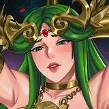
Which font do you think is better? 你觉得哪种字体更好呢?
Added 2021-09-21 03:19:38 +0000 UTC


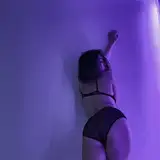
In addition is a new animation in development, and pictures ~
Today is the Mid-Autumn Festival, Happy Mid-Autumn Festival!
另外是正在开发中的新动画,和图片~
今天是中秋节,中秋节快乐!


Comments
Happy mid-autumn festival!
Weeb
2021-09-24 09:01:14 +0000 UTCSuper cute drawings! Also i think 2 looks miles better than the other ones. Keep up the good work!
Hugs
2021-09-24 00:47:05 +0000 UTCcan you make a fish sauce in the water place please :(
Grace Mastrude
2021-09-23 01:28:02 +0000 UTC中秋快樂~ 辛苦大大~
空幻
2021-09-22 14:52:20 +0000 UTCOh, the second font is the pixel font that minecraft is using. This font includes almost all languages in the world, which can reduce the workload of translation, but the disadvantage is that it is too small. If you enlarge this word, the effect will become different
Snow Dragon
2021-09-22 06:14:58 +0000 UTCThose are pretty cool and Interesting I prefer the 3rd one considering it is slightly bigger and much easier to read I also like the new transfur and transfur scene! Good job and keep it up!
Thorne Borg
2021-09-22 04:29:30 +0000 UTCHappy Mid-Autumn Festival! While I myself cannot read Chinese very well, at least not well enough to make a confident choice, I think that the second font is the best one - it appears more clear and though a little thin, it allows for the most detail in each character without compromising the consistency of the thickness of the characters; for someone like me who is (very very slowly) learning a little Chinese, they are the easiest to read. The first one, while neat, makes it hard for me to figure out what character is what and the third has inconsistent thickness between the characters, which to me, is distracting. Though these are just my thoughts, and you probably will have better answers from people who can read and speak it way better than I.
JNY4
2021-09-22 00:34:51 +0000 UTCMaybe have it as an option in the menu
TJ Productions
2021-09-21 16:11:26 +0000 UTCi like 1 :0
Emanuel Animando!
2021-09-21 15:54:50 +0000 UTCI like 1 but the people have decided and i doubt that were getting it so 2 it is XD
Aqua Wav
2021-09-21 14:01:53 +0000 UTCI think 1 match better with the game's style
Blood_Crayons
2021-09-21 13:23:38 +0000 UTC1 or 2 is fine imo
Neco the Sergal
2021-09-21 05:52:17 +0000 UTCI probably shouldn't vote because I can't actually read it at all, but 1 looks like it would be difficult to read even for a native speaker.
Grey
2021-09-21 05:09:33 +0000 UTCit's a shame when it's the middle of autumn in many countries and there is no snow at this time. And it's already snowing at my place(
susp
2021-09-21 04:11:10 +0000 UTC中秋快乐~不过这三个字体不是一样的咩0.0
秋沐泽
2021-09-21 03:50:13 +0000 UTCI think 3 looks charming in a way.
2b3b
2021-09-21 03:38:37 +0000 UTCFont change? Uh oh!
Rapax or 希狐
2021-09-21 03:24:32 +0000 UTC獸大快樂中秋♪(゚▽^*)ノ⌒☆
ObuRibion
2021-09-21 03:22:30 +0000 UTC第一个看不清字,第二个看着很舒服,第三个粗细不一不是很舒服(个人感受)
lostmet
2021-09-21 03:22:05 +0000 UTC