(HD images are in the attachment)
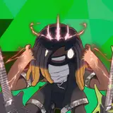
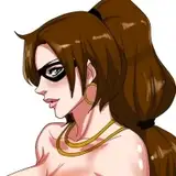
I was testing a brush pack out of a random doodle. It seems easier to find the ideal value range when using bigger and flat brushes, and just see the object as some basic cylinder/sphere. But it's very hard to control forms and foresee what I'm going to design while using them to paint.
No strict plan, just trying to paint further. In the end there are too much values and I lost the control of forms.
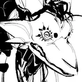
Using construction lines to help me control the forms. And I also get some ideas from my wonderful Patron's suggestion via PM :D -- drawing some balls first. (Actually no one told me to do this but I guess it can help haha) So I can have better idea to choose the value range and how I'm going to render those forms.
...And I still messed up the forms when trying to add more smaller details. (the messed up part is not shown in the process photos)
Well uh maybe I just need to use even less values to design forms I guess.
------------------------------------
(過程大圖請從附件下載)
測試筆刷亂塗,結果意外畫出很理想的灰度,BUT整個型體就呃越畫呃越崩。是說用大號的平筆刷很容易就能堆出漂亮的灰度,但結果也只會有灰度漂亮而已。很難抓到啥時才是適合開始用小筆刷的時機,要嘛灰度跑掉要嘛就形體糊掉,真的很兩難。
沒什麼計畫就直接繼續硬畫下去。想當然爾結局就是玩灰度充滿樂趣但丟掉了形體。中間試著再蓋上線稿再重新設計形體,但用這招補出來的肢體和塊面還是太生硬,缺乏設計感。
用大量的弧型輔助線打草稿,想說輔助線這麼多接下來怎麼畫都不會崩掉了吧。另外從熱情贊助者的私訊建議中得到一個靈感:先畫幾個球球。(其實沒人直接建議我畫球球,但想想畫幾個球搞不好真能幫上忙也說不定)先用帶光影的3D球體來決定整個形體大致要套用哪些範圍的灰度。起初覺得真的挺好用的,想不出來灰度要選幾趴的時候,直接用滴管去球球上吸一吸就好了。
但在持續追加更小更精細的塊面之後,這臉還是被我畫崩了。(灰度好像還行啦但形體崩惹)
所以本月練習得到的結論是...想專心設計形體,灰度可能還是越精簡越好。