![[STATIC] NNI](https://img5.xaiju.com/storage/6/wr/mz/d38796-019e8e86-5abd-73b2-9bbc-4760736fbf2a.png)
![[STATIC] NNI](https://img5.xaiju.com/storage/12/up/dx/d38796-019e8e86-5ac4-7da9-ae76-86b6a2b6ab43.png)
![[STATIC] NNI](https://img5.xaiju.com/storage/8/cc/cn/d38796-019e8e86-5ac6-7370-9da0-50f9fe0dd262.png)
![[STATIC] NNI](https://img5.xaiju.com/storage/1/pi/rc/d38796-019e8e86-5aeb-781e-a5da-98eecb2d0702.png)
![[STATIC] NNI](https://img5.xaiju.com/storage/2/sj/hd/d38796-019e8e86-5af7-7a68-9908-c878fcf1a298.png)
![[STATIC] NNI](https://img5.xaiju.com/storage/5/cw/um/d38796-019e8e86-5afd-7d68-a0a5-b347523dfab5.png)
![[STATIC] NNI](https://img5.xaiju.com/storage/10/jb/kp/d38796-019e8e86-5b02-73da-a4ad-db046ed133e9.png)
![[STATIC] NNI](https://img5.xaiju.com/storage/1/op/li/d38796-019e8e86-5b0f-74bc-842b-952f3200b5c8.png)
![[STATIC] NNI](https://img5.xaiju.com/storage/9/cp/bc/d38796-019e8e86-5b1b-7f15-bec1-092dc9062cb6.png)
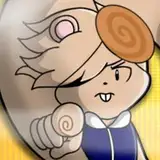
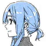
I T I S G A R B A G E D A Y
Why yes, I am using my Disney+ subscription for evil.
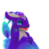
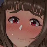
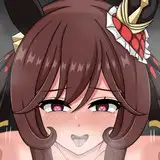
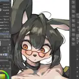
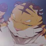
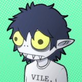
Lately, my art has felt kind of off to me. So, I did this as a style study. "How do animation studios have flat colors but still have more depth than my shitty art?" I asked myself. And, I kinda figured it out. If you zoom in, the lines are supposed to be colored. It's subtle, but the effect is definitely there. Pretty darn cool. And yes, I am looking for ways to cheat instead of just learning how to properly do shadows.
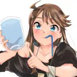
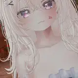
I also got some critiques from a friend, so with this one I worked on trying to get the head at a different angle, have more dynamic expressions, work with different facial proportions and body styles, and add more depth to the body. I don't think I achieved much depth, but I'll try harderer next time. I think it was a good exercise trying to mimic the specific aesthetic of this movie. Fellow artists here, I'd recommend trying this out too. Take a piece of art or animation or whatever that you really like, and try to mimic it. Do what I did here and put a scene together that is clearly, clearly not actually in the movie, dear god. Make something new, but try to make it look like it's from the movie or whatever. Super fun exercise. You'll probably learn what exactly you like about the style in the first place, and you can incorporate it into your own.
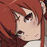
I may or may not go back and animate this one. But that'd be much later, I still have those others to finish first.
Androo Gnoix
2022-02-11 02:06:09 +0000 UTC