As always, when I shift gears from one task to another, I feel out of my depth and anxious. In this case, I've switched from inking (thinking in terms of black and white lines) to colouring (thinking in terms of value or light-and-dark, and forms and shapes). I want to share some of the methods I use to keep myself feeling good and steer myself toward "successful" colour ideas.

VALUE THUMBNAILS
Here's a true fact: I had NO IDEA the page above was going to turn out looking like that, with those colours. But I did know what I wanted to emphasize: the brightness of the bridge and the fortress walls, the mood of the foreground figures, and the time of day (pre-dawn).
In the value thumbnail, you can see those first features emphasized:

The bridge is high-contrast bright against the dark background, the foreground figures are high-contrast against the light part of the background.
If you look at the colour image, you can kind of see things working out this way. To be sure, let's look at the same image in black and white:

That's pretty close to the value thumbnail. And an important thing I always keep in mind is: if your values look right, your image will look right, almost regardless of what colours you end up choosing.
In this next example, I didn't expect the sky to look like that in the second panel, but I followed the Value Thumbnail and I like how it turned out. When I was working on the value thumbnail, my priority was: let's get some interesting lights and darks, and let's make our characters stand out against the backdrop. I didn't worry about the specifics until now.


Meanwhile, the next example worked out relatively straightforwardly. I just have to remember to add the bright birds in against the background on the left.


If it's hard to see how the colour image relates to the Value Thumb, try squinting.
Now, regarding that first image (the "pre-dawn" one), I'm still not 100% satisfied with the way it's working in colour, but fortunately, there's another thing I try to always keep in mind…
RELAX, IT'S JUST THE ROUGH COLOUR SCRIPT
I have to re-paint everything at the final size, anyway, so I get another chance to re-do everything. There's no point fussing TOO much on the colour script when the image is going to be revisited as part of the process anyway. Plus, a funny thing I have noticed with colour is it's not until all the pieces are in place that a colour image looks "right." It takes a lot of work to get 90% of the way toward a finished image, but might look completely wrong the entire time. Then you put a few shadows in the right place and balance the brightness of another element and oh, look, it's all come together.
This is an extreme example of that. These two panels took me all of one morning. I thought they would be simple and straightforward, but I struggled a lot.
The concept was simple: I just want it to be extremely dramatic, like theatrical lighting. I wanted the neat patterns of the light shining through the ballusters (or whatever they're called). The difficult part was that I couldn't tell if the cast-shadows on the wall were working until I painted in the shadows everywhere else and added tinted shading to the characters.

I still look at it and think it's missing something, so let's check it in black and white:

To my eye, it reads well in black and white, so you know what? The problems are probably because 1) it's still roughly-painted, and 2) I'm probably in my head too much. The colour script has given me enough to start with. When I go to the final page, I'm confident it will come together.
SAMPLING
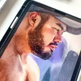
For reasons I don't fully understand, I can't shake the feeling that it's shameful to sample photo colours. Here's a panel that I think is very successful. It reads well and, most importantly, the mood is spot-on.

And here's the photo I referenced while I was working on it, which helped me to understand the mood I wanted and provided the sort of colours I needed to achieve it:

And as I was feeling like I was "cheating" (note: you cannot "cheat" at art) I was listening to music I like, and I noticed, "hey, this song is basically built entirely from samples of other songs, and I don't hold that against it. In fact, that's part of what I like about it." So I'm going to not be hard on myself.
THE BABY TEST
Comics author Scott Chantler has been emphasizing, "don't make your comic entirely out of medium-close-up talking heads." (I'd link to the tweets, but he seems to have hidden or deleted his account.) He argues it makes for boring comics. I sort-of agree and sort-of don't, but I did notice something similar recently.
I read a lot of books with our toddler wherein he points out the wheelbarrows and diggers and tractors and bicycles and cats and the moon (he loves pointing out the moon) and he finds Goldbug instantly on every page. The other day, I tried showing him one of the graphic novels I was reading. It is a well-regarded recent release, and very handsomely drawn. We flipped through a few pages.
There was very little for him to point at and identify.
I'd search each page myself, looking for nouns he might be interested in, but noticed that it ended up being "here's this character and there's that character." I felt sad, because the book suddenly seemed very thin.
So I'm thinking to myself, maybe, like The Bechdel Test, I need The Baby Test.
Does this book have a wheelbarrow in it? Doesn't pass The Baby Test. Is there a page where I can count the number of pigeons? Doesn't pass The Baby Test. Are there no tractors? Doesn't pass The Baby Test.
I'm being flippant, but I think there is something here: everyday objects (and cats) tell us about the characters and the world they inhabit. If they don't add story context, they at least add texture and a feeling of life. I suspect that if you can't sit down with any graphic novel and enjoy a few minutes with a curious toddler, pointing at nouns, even the best book might be lacking.
I'll keep thinking about this. I know it's more than just "don't give me a comic full of talking heads" -- that's a fine standpoint, but is not quite actionable enough. It's certainly more complicated than, "put a tractor on every page," but what if it were kind of like that? What if the approach were, "how do I make this interesting for a toddler?" What if we thought, "it's time to include something that could potentially be a toddler's favourite page?" Even if it were the adultiest of adult books. If we thought of each comic page or sequence that way, what effect would it have? I suspect it couldn't hurt.
Regardless, I now have a post-it note on my monitor saying "ADD WHEELBARROWS." Look for those in Chapter Two.
More colour script updates next week, and I might share the musical sequence so I can't chicken out and cut it from the book.
Keep it colourful,
TC
Neha Dinesh
2022-05-10 03:48:56 +0000 UTCTony Cliff
2022-04-29 18:03:39 +0000 UTCTony Cliff
2022-04-29 18:02:14 +0000 UTCTony Cliff
2022-04-29 17:57:01 +0000 UTCThomas Price
2022-04-29 17:40:28 +0000 UTCJoel Mangrum
2022-04-29 10:25:17 +0000 UTCTealin
2022-04-29 07:34:00 +0000 UTCLisa
2022-04-29 01:53:57 +0000 UTCTony Cliff
2022-04-28 21:47:38 +0000 UTCTony Cliff
2022-04-28 21:26:03 +0000 UTCtom works
2022-04-28 21:23:21 +0000 UTCmkreed
2022-04-28 21:22:58 +0000 UTCTony Cliff
2022-04-28 21:22:29 +0000 UTCTealin
2022-04-28 21:20:33 +0000 UTCTealin
2022-04-28 21:20:12 +0000 UTCTealin
2022-04-28 21:15:02 +0000 UTC