Let's take a look at some of the choices that we get to make during the scanning and page-prep process! All the images above are duplicated below, just FYI.
But first:
BIG SCANNERS ARE STILL EXPENSIVE
I began the scanning process by looking at prices for Epson large-format scanners. Bad news: they're still diabolical! A professional-quality 11x17" Epson scanner typically costs CAD$4,299 as of this writing. $4800 after tax. The 8.5x11" Canon scanner I use right now cost me $100 ages ago, but it means I have to spend a few days stitching my pages together. For Chapter Two (88 pages long), I will spend three days scanning, stitching, and adjusting images. Let's say my time is worth $340 per day, which is a solid studio job in the local animation industry. So a $4800 scanner pays itself off if I save 15 days worth of scanning. Let's assume the big scanner halves my scanning and processing time. And let's say I've had to scan 800 11x17" pages so far, making all my books. With my old scanner, that's 27 days total spent scanning. That would be 14 days if I had a big scanner. So if I'd bought one way back when I started, it would only now be starting to pay itself off.
Here's the twist, though: for DD2 and DD3, I used other peoples' 11x17" scanners for free, so who even knows how this all balances out now.
And what if on one of those days when I was inside scanning, I avoided a timeline in which I was killed in an automobile collision? Not only have I saved $4700, but also maybe my life. Think about that.
OKAY. Enough of that nonsense.
WHAT'S INVOLVED IN SCANNING?
First, I scan every page in two to three pieces, because I only have a small, inexpensive (but optically very good) scanner. Then I stitch them together, remove all the blue lines, use the Levels adjustment to balance out the values, and then the pages are ready for borders and lettering.
Here's what a page looks like, fresh from the scanner.

I remove the blue lines using Photoshop's "Black and White" adjustment layer.

You can still see the brush strokes in the solid black parts and the paper texture in the solid white parts, so I use the "Levels" adjustment to make the white parts white and the black parts mostly black. (Some people would use the "Curves" adjustment for this. In my experience, Levels works just fine even with tricky things like the dynamic range on the pencil shading (more on that later), and it's simpler.)

Here is specifically what I am looking for during this process:

BALANCING OUT THE MULTIMEDIA ELEMENTS
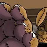
Traditionally, comics have been inked black on white because it makes the art easy to reproduce using mid-century technology. It's high-contrast! But I'm out to cause trouble and insist on using grey tones in my artwork. I add graphite-shaded areas and watercolour for texture or for the particular material effects. Unfortunately, that makes it more difficult to adjust than pure black-and-white art is.
Here's a panel that features some relatively subtle shades made using graphite. In the raw scan, you can see how even the darkest graphite is easy to differentiate from the ink, which really is much darker. This is where the image has the most dynamic range—that's what allows you to differentiate between the darkest graphite and the ink, or to see the brushmarks within the ink. Dynamic range is maybe the same as visual fidelity.

UNFORTUNATELY, it also means we can see the paper texture, which is not what I want. Since this will be coloured digitally, I want the white parts to be as clean and pure white as possible, so that the paper texture is not unintentionally influencing the colour. So we have to knock that out.
If we go too far, we get nice clean whites, but we lose definition in our pencil work. Some of it disappears entirely.

If we are too precious about trying to preserve the light pencil shades, the white parts can retain some unwanted texture.

So we compromise, looking for the best balance between cleaning up the whites and blacks while preserving what we like about the middle values. Most of the literal nitty-gritty is invisible unless you zoom way in and be a perfectionist about it. This will be easier to see in Patreon's gallery view.

INK AND PAPER CHOICES
For half of Chapte Two I was using brush pens on Opus store-brand drawing paper. I like the pens because they're clean, fast, and easy to use. I like the paper because it is a very bright shade of white, so produces good scans. It's what I used for most of the previous DD books.
However, back when I was experimenting with pen nibs in Chapter One, I noticed that Strathmore Vellum Bristol paper held a much tighter ink line. It bled a lot less than the Opus paper. This never mattered to me before, because I wasn't using ink in previous DD books. Now I am, so I bought a lot of Strathmore and started using it.
Looking at the pages IRL, I felt pretty certain that the lines on the Strathmore are noticeably cleaner-looking, especially using the Dr PH Martin's ink, which dries fast. However, looking closely at the scans, maybe the difference is not that great. Here's a comparison.
Brush pens on Opus paper:

Brush-and-ink on Strathmore paper:

You might not be able to see it unless you look really close, but what I'm looking for here is the "tightness" of the line. I want it to be like a good apple: crisp, not fuzzy.
IMPORTANT NOTE: none of this really matters. Any fuzzies will not be visible A) at the final printed size, unless we make a full-sized edition of the book and even then it's doubtful that a printer has enough resolution, and B) at the speed with which most readers will be taking in the book. But I do like being persnicketty about these things.
Okay, off to finish stitching and processing these pages. Next week's update should feature some lettered pages, which is where everything finally starts to look like a real comic. Again.
And a note to myself: when I start flatting, I should reference my value thumbs, for clever reasons that I will hopefully remember to explain during the flatting process.
🖥
TC
Emma Spronk
2022-05-01 01:49:31 +0000 UTCTony Cliff
2022-04-14 19:30:14 +0000 UTCBrian Harold Taylor
2022-04-14 14:22:09 +0000 UTCjonsullivan
2022-04-12 09:30:46 +0000 UTCtom works
2022-04-10 20:02:00 +0000 UTCAbrian Curington
2022-04-10 00:38:05 +0000 UTC