download the file below to watch the process video of my prehistoric dragon painting!
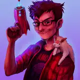
drawing this was so much fun, though challenging at times. after transferring the rough sketch from a page full of doodles, i started figuring out how to pose the dragon's wings and tail. i truly have a love-hate relationship with drawing wings. it can be very hard to make them look right but they're so beautiful and can add a lot of oomph to a monster design. i rarely try to draw 100% anatomically correct wings, but even when i stretch and bend the shapes in ways they shouldn't, i want them to look somewhat convincing. trying to foreshorten wings is especially headache-inducing, but it's so satisfying when it clicks. (... i realise i recently said something very similar about drawing naga tails, so if i ever want to really challenge myself, i should design a winged naga ...)
this time, i was lucky. i was able to quickly establish a solid foundation, and successfully foreshortened the primaries of the left wing in a way that adds a lot of volume and depth to the composition. i actually had more issue posing his tail without compromising the balance of the pose, as you can tell from the numerous attempts.
i think this process is a really good example of how i tend to focus on shapes first. one might say i work from the silhouette and inwards, one body part at a time. i add indications of major muscles and outline important design features, but "sculpt" the shapes of things into being before i turn to the details "within" the outlines. as i refine the sketch, you can also see how i add guidelines for rounded and scaly areas (like his neck and tail), almost like applying half of a 3D grid. his tail is a particularly good example, especially with how it helped me draw the row of spiny outgrowths running along the side of it.
when refining the wings, i also focused a lot on the shapes. i used guidelines to figure out the placement of the primary feathers, and then "connected the dots." you could say that his wing is made up of five fields, each of which is distinct from the others. 1) the scaly shoulder, 2) the "pterodactyl" shape (replacing the covert feathers of a bird wing), 3) a large, rounded area that i think of more as a membrane than either scales or feathers, 4) the long primary feathers that fan out at the wingtip and 5) the shorter, smoother secondaries. given my art style in general and the style of this piece in particular, i could use pretty sharp delineations between each of these areas, and create a neat contrast between spiky and rounded shapes.
i lost track of how many sketch layers i went through -- i think three? -- but you can see how i keep making the older layers more and more transparent as i go. i clean it up by erasing parts of the previous layers, and keep adding more and more detail to the anatomical shapes i had previously established. it's only now that i start working on the characters' faces, hands, and other areas with small details. thanks to spending so much time on the sketch, finally drawing the lineart was a pretty smooth process, though i ended up making a new sketch for the dragon's head.
as for the colouring, i worked in sections. for the dragon, i had one layer each for 1) his wings, 2) his head, upper torso, and arms, 3) his legs and groin, and 4) his tail. after locking the transparency of each layer, i could more easily work on the different areas that overlap one another. for his elven lover, i used two layers; one for their skin, and another for their hair, t-shirt, and shoe.
i used a large charcoal brush to start adding the basic hues of the dragon's body, then switched to the "gloaming" brush for more control. this design is honestly more about the shapes and the vibrant palette than about texture and tiny details, so the rendering style followed suit. my main focus was on the "fields of colour," sharply delineated from one another in some areas and blending together in others. each field of colour is relatively flat, in the sense that i didn't really render the texture of the feathers or scales beyond the shapes already established by the lineart. also, there's only a few hints of shadows and highlights, such as on the dragon's neck, tail, arms, and the scaly shoulders of his wings.
again, this is no accident. at the risk of sounding quite artsy, i wanted to maintain a sense of balance between the lineart, vibrant colours, and rendering style. if the palette had been more muted, i could have added more detail, but with so many bright and contrasting hues i felt like focusing on the colours themselves made for a more balanced and pleasing end result. i also like this style of colouring for compositions that are as zoomed out as this painting, because i personally feel like adding a lot of texture and detail could have made it look too busy, or even messy.
i used a bit of layer effect magic to make the colours really pop and to create more contrast between overlapping elements -- for example i brightened up the wing area behind the dragon's arms. i also added a faint, pale line around the outside of certain body parts (like the arm feathers), which is another subtle trick to delineate between overlapping areas. i kept polishing some of the details, upped the contrast of the whole thing a little, and then eventually felt (in my heart of hearts) that this painting was finished. (i think i'm getting better at knowing when it's time to stop, as opposed to overworking my art!)
if you have any further questions about this process, just comment below! hope you enjoy the video! <3
// art + characters © me.