here's the process pack for this picture of ariel and logan! you can download the attached .zip below, to get access to a total of 27 pngs and 1 gif.
it was a while since i drew this, but i've been meaning to show you the process ever since. i struggled with the background and with thinking the picture looked too messy, so there was some interesting twists and turns along the way, as i was figuring things out. you're gonna see how i went back and forth with the background, trying out different colours and effects until finally settling on what it should look like.
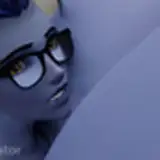
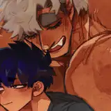
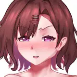
the sketch and lineart were business as usual (althought you may notice that the lines are thicker than in my more recent pieces), as was adding the basic flat colours. logan and ariel (aka loriel) have a kind of purple-toned colour scheme; ariel has purplish skin and logan is technically pitch black, but to make him match ariel better i usually pick a purple undertone for him (and for ariel's black hair). the other details and hues are chosen to go well with this purplish theme--the gold, for example, lean towards a somewhat rosy hue rather than a cold yellow one. when i added the basic colours, i picked purple hues for the background elements as well. but it's actually quite a challening colour scheme to work with, and i think that's why it was so tricky for me to finish this piece. i almost quitted on it a few times, until i eventually figured out how to make things work. but i'm getting ahead of myself...
i added some basic gradients to the characters, much as per usual--but then i started experimenting with colours for the background, as well as changing some elements around a bit. i wanted the overall colour scheme of the picture to look good but i didn't want the hues to blend into one another too much. i didn't like the dark grey and purple of step 05 at all, it looked so cold and out of tune; the hues of step 06 look much better, but as we shall see, i was far from done with the background.
i went on to lower the transparency of the lineart, and once i realised the colours were looking a little dull, i added some overlays to various parts of the picture to liven it up a bit. by this point the shading of logan was far from finished, of course, but since it was so difficult to make out his facial features against the pale background, i tried making the background darker as a contrast. i also shaded and highlighted the pillows and fabrics, using my dear old lasso select + gradient method, but i wasn't really liking the way it came out. it looked almost like the pillows were carved out of stone rather than made from soft cloth, yknow?

i left it like that for a bit, as i worked on the characters. logan came out looking really fucking chiseled in this picture, mostly because it's so fun to draw musculature that way. i also kept his scaling in mind and as you can see, once i had properly shaded and highlighted his head it's much easier to make out his features. since the base colours had been pretty dark i worked mostly 'from dark to light.' that is, i added some darker shadows at this stage too, but primarily used lighter and lighter colours (with purplish undertones) to add smaller and smaller details to his body.
aaand then i was back at it with the background. it felt too dark and i didn't like the sharp and 'hard' look of the shading; i created a new layer, filled it in with a pale fleshy colour, and lowered the transparency, to lighten up the whole thing. i suppose this would ge a good time to mention that i colour the characters and the background on separate layers, and that i use multiple layers for each character and for the background, all of them sorted into convenient folders. in this case i had one layer folder titled 'background,' another called 'ariel,' and a third titled 'logan.' and since the folder of background layers is at the very bottom, it's all behind the characters and easy to edit.
i changed the hue of the background into a colder, more blue-toned purple, but my problem now was that the colours of the background was too tone-in-tone to those of the characters. however, i finished colouring the characters before i went back to the background again. as i've previously discussed, i often prefer to lay the foundations of the background before colouring the characters. but my problem with this piece was that i didn't have a proper plan for the background in the beginning, and by this point the work on the characters and the background had both gone so far that i opted to finish the characters first. once i knew how they came out it would be easier to solve my issues with the background. so i added highlights and details to ariel and logan, and ended up reinforcing much of the lineart, because it felt like this particular image 'needed' stronger lines.
as for figuring out the background, turns out a few simple moves made a huge difference. i removed the 'line shading' that framed some of the shadows, merged all my background layers, and added a bit of gaussian blur. i figured that as a contrast to the characters it needed to look softer, but at the same time it would look a bit weird if it was completely blurry, so i used a painterly textured brush to define the outlines of the pillows and certain fabric creases a bit. i then added a pale gradient behind the 'logan' layers folder. this pale gradient was on top of both the background layers and the ariel layers, which pushed logan further into the foreground and ariel further into the background.
i still felt like the picture was a bit too dull and gloomy, though, so i decided to apply some photoshop magic. i experimented with the brightness and contrast, the levels slider, vibrance and saturation, hue and colour balance. from step 21 to step 27 you can see how i was experimenting with various photoshop settings to transform the picture into the final product. by step 27 there's a clear difference between foreground (logan) and background (ariel), so the picture is easier to read and less messy-looking--compare the final product to step 14, which in my opinion was just a mess of sharp shadows and highlights. the background is kind of soft around the edges, so it places the characters in a setting without stealing attention away from them.
all in all this was one of those pictures that i almost gave up on halfway through, but i persevered and managed to turn it into a piece i'm really happy with! and as always, if anyone has any questions about this process i'll be happy to answer them below <3
// art + logan © me; ariel © kubi.