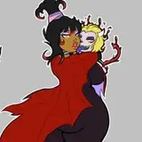
Happy yuletide everyone. ♥
I have a few notes about this sketch colouring wise. I'm quite pleased with some bits and pieces. They might be a bit hard to spot but I had great fun putting some of this new information into use.
I've done a ton of studies on colour recently and some of the things I struggled with previously was ambient lighting and relative colour. So for this piece, I worked entirely on relative colours rather than pure ones.
What that means in this case, that instead of using pure colour notes (that in the past I've had a habit of laying down before I use filters) the whole image started as a blue base and me trying to work out how say, skin colours and Anna's ribbons and Morrie's more tanned skin work in relation to that (instead of using filters). It helps create a different kind of atmosphere than pure colours from my normal palette + filters would.

Greys are especially important as they help you transition from one tone to another. There's a lot of different colours in this piece and greys also help keep things looking a bit more harmonious.
In the past I've really struggled to grasp how to do this without making my colours look messy and disjointed. I've started merging all my colour layers into one instead of having dozen separate ones for clothes, hair, skin, etc... It stops me from faffing about and second guessing my decisions and just going with what feels good at the time. I've found it quite fun and relaxing way to paint.

What that means in the future, I reckon I'm going to reduce the amount of dodge, overlay and screen filters I've quite liked using in my works and aim at more 'traditional' style painting. I'll still make use of them where it's appropriate, but I think less in this case could be more. It's been fun to practice different things so far!
AlwaysRats
2018-12-09 17:01:59 +0000 UTCMichael Hawk
2018-12-09 16:47:38 +0000 UTC