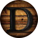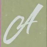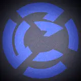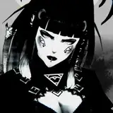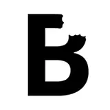
I’ve always enjoyed typography but more in the sense of graffiti, in that it’s fun to break rules and draw shapes. Most of my inspiration comes from Roger Dean, David Rudnick, and industrial safety iconography/incidental design. In particular I wanted to replicate that 80’s airbrushed mirror chrome style in the first pic (still a WIP). For the last couple sketches I looked at metal band logos for inspiration. I really like to see how far I can push the legibility!
A quick process breakdown:
I like to work off an existing typeface and then gradually cut+paste+distort until I find an interesting motif or movement I want to work with. I think this started out as optima black.

From there I sketch and noodle over the top and start to chisel out the shapes I discover. It’s all about creating interesting negative space.

Then I start to nail down some of the line weights, spacing and alignment. The final still needs tweaking but I’m coming back to it later.

Thanks for reading!
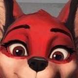
Furry Keith David
2024-09-17 06:07:38 +0000 UTC