

Hi peeps,
I need to do those kinds of posts more often!
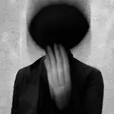
Here's a Work In Progress from yesterday!
You'll probably recognise this piece as inspired by a sketch from a few days ago, especially if you are a postcard tier patron, or follow me on Instagram (If you don't know what I'm talking about, don't worry, the sketch will be in my June Sketchbook PDF).
I still have a lot of work to do on this one, but I've decided to take it slow and do it as and when I feel like it, as I was noticing myself getting more and more stressed about how much I have to do before the end of the month, and the fact that I need to create a painting for the monthly print. I don't want this to all become a source of stress, god knows I create enough of those for myself, so I have decided to try and work on several concepts at the same time, so I can jump on one or the other as I feel inspired and motivated, instead of focusing too heavily on one piece to finish it as soon as possible.
Plus, I always get a little overwhelmed before I start a piece, because I have so many ideas I want to explore, that I never know where to start, so maybe having a few on the go will help me feel less torn.
So far, on this one, I need to push the skin tones further, and I also want to add a bunch more white butterflies.
I am also thinking of turning the red into gold (not with gold ink, but with gouache. I tend to feel that gold ink works best for original or hand embellished prints, but doesn't do well on regular prints). The red wasn't intended to look bloody or gory, but I feel like it looks too graphic now. What do you guys think?
I also need to figure out how I want the hands to look, and I want to add some subtle, dark foliage in the dark background.
I used a palette I treated myself to recently to paint a bit of this piece.
I found this absolutely ridiculously gorgeous stationery/art shop in central London the other day, and spent way too much time in it drooling over all the things I couldn't afford. The store was so beautiful they literally had a sign in the window telling people to ask before taking pictures, as it was becoming a nuisance, hahaha!
I ended up buying a few pencils, as well as this beautiful watercolour palette.

It honestly feels made for me!
Those colours are pretty much what I mix for myself most of the time, haha.
The translated names also make my day, they are hilarious.
My favourite colours in it are obviously Reddish Black (1st one), and Purplish Black (5th one), but they are all wonderful.
The box has very little writing on it, and only says "Japanesque Colour" in English, although there is also a web address www.boku-undo.co.jp.
After doing a little digging, I found this palette under the denomination
Boku-Undo E-Sumi Watercolors.
I initially thought that they might be Gansai Tambi Kuretake paints, but they aren't! From what I found, they are pigment based Sumi Inks, similar to the Kuretake, but they don't dry shiny if applied thickly, like my Kuretake paints. I'll have to do some more research into them.
I don't think these are lightfast, I will have to test them out myself as I can't seem to find much reliable information about them. In the meantime, I am using them sparingly, and in combination with other lightfast colours.
They are definitely delicious though!
Anyway, I hope you enjoyed this little peak into my latest WIP!
Take care everyone,
M