XaiJu
eromancer
eromancer

patreon


Inner Circle Update for April 14 2019!

Hey guys!

Currently things are looking good for the Pure Onyx release to happen in the next few days.  I figured I'd drop one more quickie IC update just to get caught up before discussion on it overshadows stuff :D.  


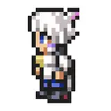
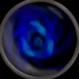
Pure Onyx User Interface Concepts

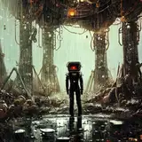
While Mr. Kittyhawk has been coding remaining stuff for the H system, I created some concepts for the user interface!  One of our favorites is the loading / utility screen concept shown above, which would feature animated sequences utilizing some shader magic on the sprites.

Check out the full size versions of the UI concepts here, and please let us know what you think:


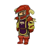
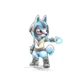
More Boss Artwork @_@

TK and I have been making progress on Onyx's move set artwork, which we'll start showing off after the release.  In the meantime, check out the progress Limbo's been cranking out for the boss!

I still have to go through and do some final anatomy / scaling edits -- of which you can preview in the Idle pose image below.


Inner Circle Update for April 14 2019!

Comments

Same boat. Really looking forward to the next build.

QuestionablyInsane

Happy Easter team! 'Currently things are looking good for the Pure Onyx release to happen in the next few days.' Don't get our hopes up like that!

Venus

I getcha. I don't know how bullet/ punch sponge-y you want to get your enemies... But maybe just having it so health bars are strictly percent based rather than out of oh so many hit points repeated over and over might be the way to go? If the enemies just look like they are getting less damage you'll know you have to hit them more... But yeah that only works as long as you don't have enemies with ultra massive health because it might not be viewable that you are doing damage! I do like your multiplier number rather than different colored health bars better. It keeps the UI colors consistant. :)

QuestionablyInsane

Oh, the X2 indicates # of bars of health the enemy has. Retro beat 'em up games traditionally have different color health bars to indicate # of bars, but it makes the UI look like a rainbow. Instead of using color coding, we may try this (it's seen in some modern action RPGs). For multiple enemies, we're considering stacking the bars of recently hit enemies and flashing the enemy icon when they take damage to differentiate them. Won't experiment with this till later though -- it may be messy, I just would like to avoid floating health bars.

Ha honesty is the best policy. He'll 'fold' her better if he's a little bigger in all aspects.

Venus

I just wanna see him fold her in half, really. :P

MangoFishSocks

Yeah Feature creep is real... But yeah They have asked for input at times... One of the key things with this form of animation is you can do skins semi easily... So we are just putting out "It'd be nice to haves" and see what sticks. :)

QuestionablyInsane

Bordering on scope creep, maybe just make her makeup more messed up in the current cycle?

Venus

The larger size does make the boss seem more threatening.

Venus

A picture paint a thousand words, that UI concept brings it all together splendidly.

Venus

Oh shoot I should mention I'm in love with the UI art wise! Very pretty and goes with the 80's cyberpunk theme! My only issue I see being a thing functioning wise is the readability of the Enemy health bar. I take it that the health bar down at the bottom is going to only be for the enemy you last hit? And the x2 icon... I like the idea of having an enemy counter but having the x2 right on the health bar reads as "two enemies have this EXACT health." I think an icon with a number located a bit away with an enemy counter might read better maybe? Also I just as a personal preference... I like my health bars to be present on all enemies and just not last hit... Just yeah... That does get messy UI wise if you have a ton of enemies.... But yeah... Love the art... Loading screen looks really cool!

QuestionablyInsane

Yeah I was thinking if there was a lives system that It'd be cool to have Onyx's cloths get more tattered as she lost lives. So like her cloths stays the same until she loses all her health then she'd lose a life and some cloths... And maybe have her makeup get more messed up.

QuestionablyInsane

Do you have any plans for the armor damage? Bare skin seen through ripped clothings would be so hot like hanging tits poped out of her shirts and she tries to cover it with one hand

Yeah perhaps his pants make it look more wide. But I think it would also look good if he's not lean-built like fitness model but more like chubby-style built with some scars and hairs on his stomach

Hmm his thighs are built, but hips look bigger because of the armor. Check out some old bodybuilding photos, it's pretty alarming how tiny the waist stays with that aesthetic.

Don't you think the boss guy has too wide waist-to-hip ratio considering he is a male?... That feels less masculine

O.K: I said consistent twice, I think I was convinced of that specific point :' )

Purple Witch

The UI and the Loading screen, the overall Art Style is wonderful, mark my word. It is consistent, has a fighting game vibe, a neon futurist feeling, it is all consistent, I love how it turns out! I feel like it was the same with MATM; there was a choice in the UI design, and it didn't feel off-set! Just keep up the good work, I love your projects, and your dedication!

Purple Witch

Love the stylized loading screen, it all looks really polished. can hardly wait for the next update.

I'm still considering increasing his overall size some, but I tried to use their most straightened out poses for that. Their size difference becomes a lot more obvious in other poses <a href="https://cdn.discordapp.com/attachments/418449471760891904/567228688274423828/unknown.png" rel="nofollow noopener" target="_blank">https://cdn.discordapp.com/attachments/418449471760891904/567228688274423828/unknown.png</a>

The animation thing on the loading screens is a very nice idea. Lapsing the scaling of the individual parts of it (Onyx, the enemies, the black sections and the red section) would make it look very old school, so there's an idea. I expected the Wraxe boss to be quite a bit taller than Onyx, say, like an extra 25% on top of his current height, but currently it works too.

MangoFishSocks


More Creators