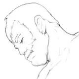
I really can't tell. The top one with the more saturated and darker colors, or the bottom one. The top one seems more dramatic, but the bottom one is easier on my eyes.
LordAsshat
2016-01-19 05:52:54 +0000 UTCJean Sorter
2015-12-11 06:06:25 +0000 UTCHivedragon
2015-12-10 23:55:52 +0000 UTCA. Michael Liska
2015-12-10 02:07:17 +0000 UTCRunus Brewblade
2015-12-09 22:21:40 +0000 UTCCorsair
2015-12-09 19:13:44 +0000 UTCFariaAslo
2015-12-09 17:44:36 +0000 UTCCain
2015-12-09 17:36:25 +0000 UTCThat black guy
2015-12-09 17:12:48 +0000 UTCGreg
2015-12-09 17:07:54 +0000 UTCmakai9
2015-12-09 13:55:38 +0000 UTCSorrowBorn
2015-12-09 13:23:51 +0000 UTCEnjuno Juju
2015-12-09 12:23:30 +0000 UTCDresdenQ
2015-12-09 10:59:06 +0000 UTCBlightTheEternal
2015-12-09 10:57:30 +0000 UTCAce
2015-12-09 10:53:14 +0000 UTC