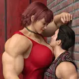
So the first panel was done in the new style I've been trying out. I render everything as a black and white image, and doing all of the details through value. It's really fun to do, and I really think it looks cool, but adding colors to colorless render isn't as simply as pressing a button. I have to use various layers of overlay and multiply to get the colors I want, none of which really corelate directly to what they look like when I sample them, so each time is guesswork. In a single image this isn't much of a problem, because I can make that look however I want, but for a comic it's very annoying. I do like the way the top panel came out though. I like the sort of muted uniformity to it, but it doesn't pop as much, and the skin looks muddy.
The bottom right panel is my classic style. I do the line-art on one layer, the flats on another, and then I basically add shades, shadows, and highlights with multiply and color-dodge layers until I'm happy with what I got. This is the method I'm most comfortable with, by its very amateurish, and I'm never really in control of what the final product comes out as, and it's very easy to over-saturate or spend too much time focusing on something that they eye shouldn't be drawn too anyway.
All in all, I'm still having a lot of trouble finding a method I like, a 'permanent' way of doing things.
makai9
2015-08-04 13:36:39 +0000 UTCAce
2015-08-04 09:53:13 +0000 UTC