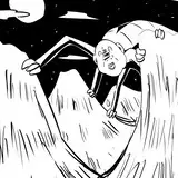
Check out these lil buttons.
Added 2019-09-06 03:16:08 +0000 UTCHello! I got some feedback that the original buttons looked squashed, so I told AE | Dagger to give the backgrounds a more circular look. I'd love to know what you think!
Here's the before:

And here's after:

Hopefully that looks better. Let me know!
Comments
Well, I don't think the difference is obvious, so you can take that for what it is worth.
Skunkupine
2019-09-08 13:42:45 +0000 UTCHah, they are not, actually. The easiest way to tell is that arrow around the clock. It's much straighter in the bottom pic. Do you think this looks alright or still bad?
Bawdy Ink Slinger
2019-09-06 15:43:06 +0000 UTCYou may want to check if you uploaded the correct after picture - they look the same to me right now.
Skunkupine
2019-09-06 11:37:42 +0000 UTC